
One color palette Color is a vital component in any design or decoration, acting as a guide that gives life and personality to a project. In the digital and physical world, the influence of colors is undeniable, playing a significant role in the perception and emotions of those who see them.
Whether you are new to the world of design, an enthusiast or a seasoned professional, understanding and creating your own color palette is crucial to the success of your projects.
What is a color palette?
Color palettes are specific, harmonious sets of colors chosen to convey a particular message or feeling. They’re everywhere, from website design to living room decor. Colors are not just visual; they carry meaning and emotions.
For example, light greens in hospitals convey calm, while orange or red in restaurants can stimulate appetite. Choosing the right colors is about more than just aesthetics; it’s about communication. And to achieve this effective communication, choosing a good color palette tool is key.
04 best online color palette generators
Choosing the right tool can be challenging, as each one has its own unique characteristics. Below, I’ve highlighted some of the best options available:
1. COLOURlovers
COLOURlovers is not just a tool; it’s a community. With a user-friendly interface, it allows users to seek inspiration, share creations and even extract colors from images. In addition to traditional features such as COPASO and the HSV/HSL selector, the site offers rich discussion groups where professionals and enthusiasts can exchange ideas and tips.
2. Color Explorer
Among the online tools, the Color Explorer stands out for its comprehensiveness. It not only allows you to create and extract palettes, but also offers advanced shading, lighting, and saturation options. Additionally, its color conversion functionality is a boon for designers concerned about color accuracy between digital and print media.
3. Adobe Kuler
Integrated into the Adobe ecosystem, Kuler is a natural choice for many designers. It allows you to create palettes from scratch or using images. Its integration with software such as Photoshop and Illustrator makes life easier for professionals who work with these platforms on a daily basis.
4. Color Scheme Designer
THE Color Scheme Designer is a versatile and accessible tool. In addition to the standard color palette features, it offers a real-time preview of how the selected colors will look, which is invaluable for designers and decorators.
How to choose color palettes for decoration
Decorar é uma arte, e a color palette is the canvas. Here are some tips to help you choose the perfect palette for any project:
- 1. Customer preferences: Start by learning about your client’s favorite colors. This is a great way to ensure that the space reflects their personality and tastes.
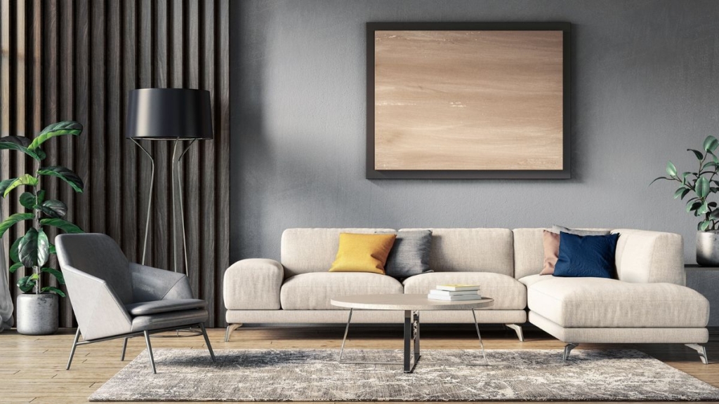
- 2. Decoration style: The style of decoration dictates the color palette. Modern environments can favor bold colors, while minimalist spaces can benefit from more neutral tones.
- 3. Effect of colors: Colors have the power to evoke emotions. Warm colors like red and orange bring energy, while cool colors like blue and green are calming.
- 4. Test before deciding: Using online tools to simulate color combinations can be an effective way to visualize the final result.
- 5. Diversify by environment: Don't limit your color palette to a single scheme for the entire house. Each space can have its own palette, as long as there is overall harmony.
- 6. Stay updated: Being aware of current color trends can provide new perspectives and inspiration for your projects.
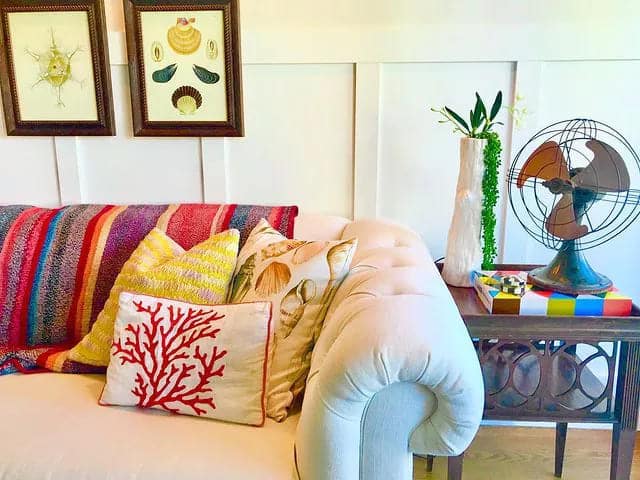
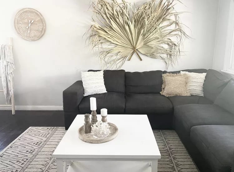
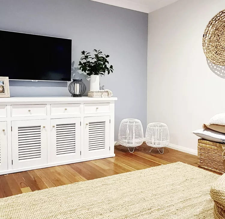
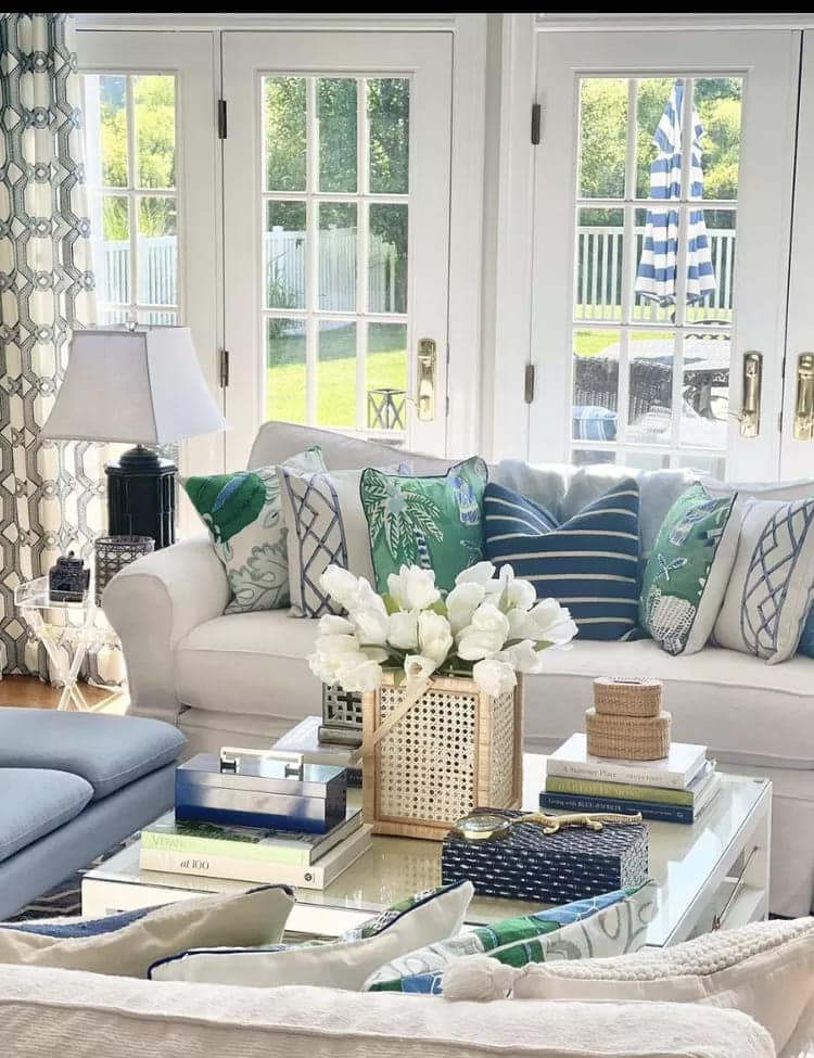
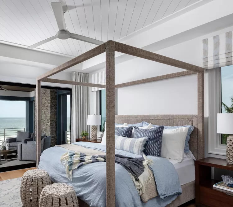
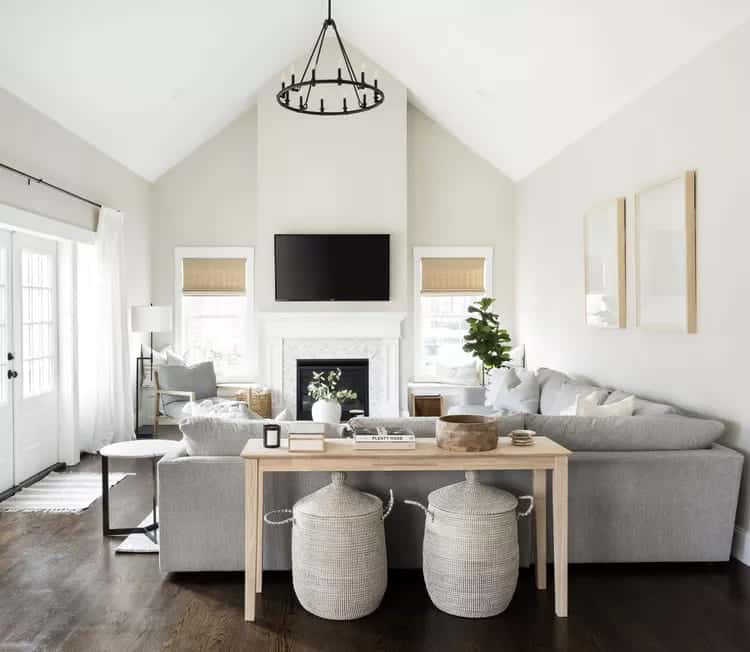
Color Palette: 23 Inspirations for Decorating Relaxing Spaces
The charm of the beach is something many people want to bring into their homes. Colors that evoke the ocean, sky, and sand have the power to transform any space into a relaxing retreat. If you want to capture that feeling in your decor, choose the color palette right is the first step. Dive with us into 23 color combinations inspired by the beauty of the coast.
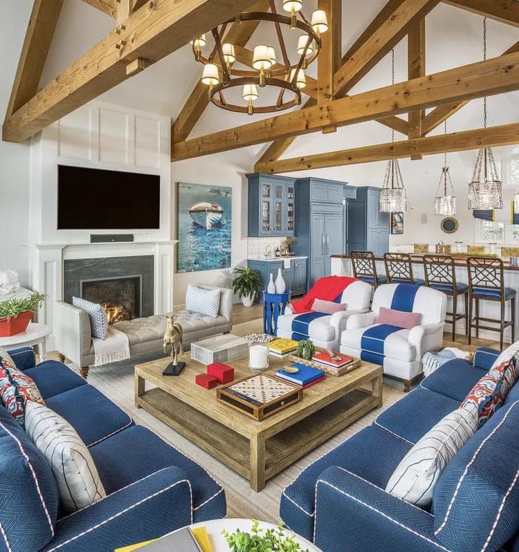
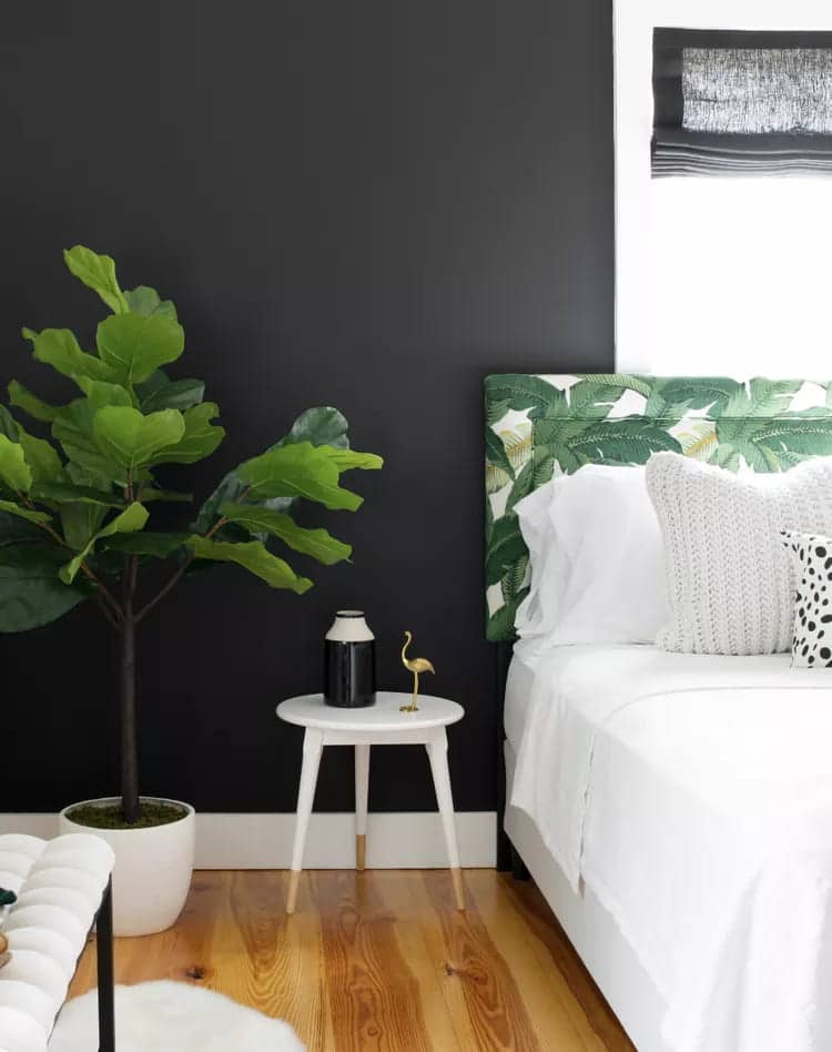
1. Color Palette: Red and yellow
When thinking about blue color palette, you might be surprised by the inclusion of coral. However, this vibrant hue, combined with touches of gold, can bring the warmth of a beach sunset right into your living room.
2. Pink and green
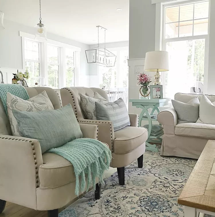
This soft combination evokes cool mornings by the sea. Ideal for bedrooms or relaxation spaces, where serenity is key.
3. Golden Sand and Emerald
That blue palette, with touches of emerald green, is reminiscent of vast beaches and the deep ocean. The combination is perfect for creating a welcoming yet sophisticated atmosphere.
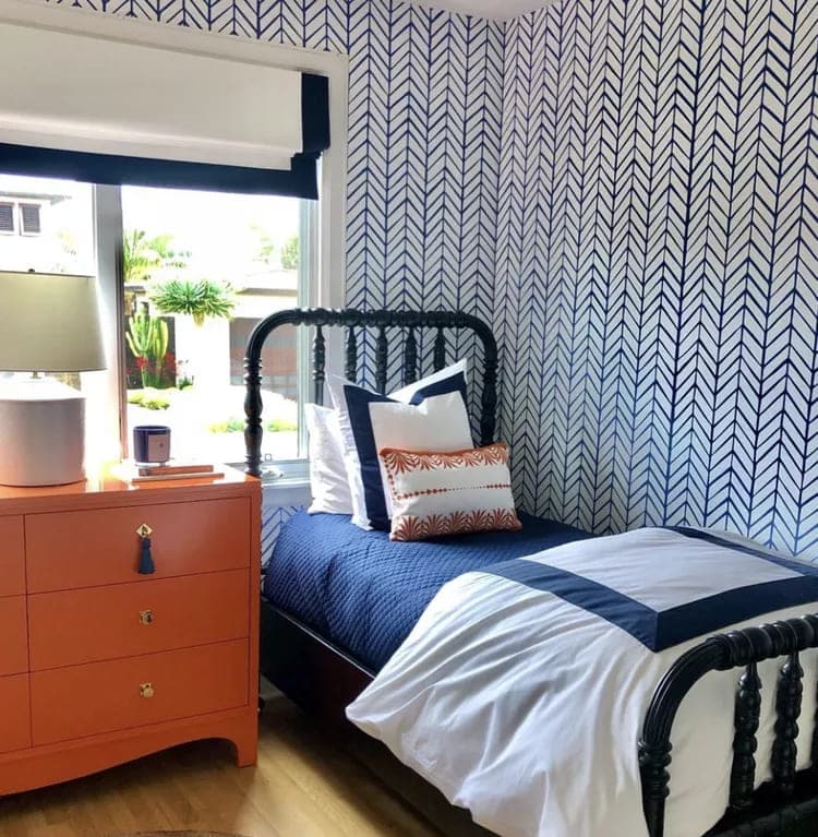
4. Deep Navy Blue and Pearl
A classic duo that brings the feeling of the deep ocean and sparkling seashells to the beach. This online color palette is a safe bet for any environment.
5. Pastel Pink and Sky Blue
These soft hues are reminiscent of the evening sky and the color of delicate shells, providing a feminine and dreamy touch to a space.
6. Desert Beige and Bright Turquoise
This contrast between neutral beige and vibrant turquoise brings to mind the view of a sunny beach, making it an excellent color palette for living room.
7. Solar Orange and Deep Blue
This energetic combination is reminiscent of the bright sun against the vast blue sea, perfect for spaces seeking a touch of vitality.
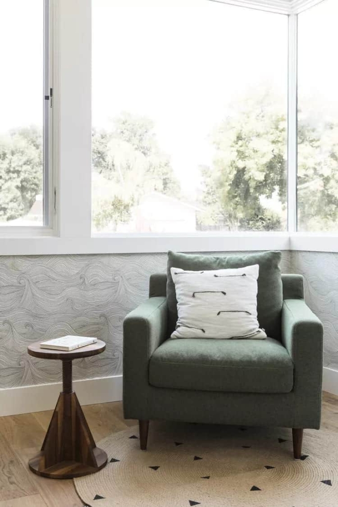
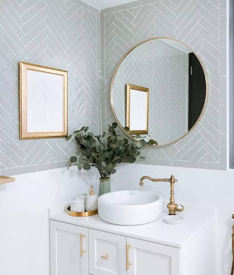
8. Soft Shades of Gray and Navy Green
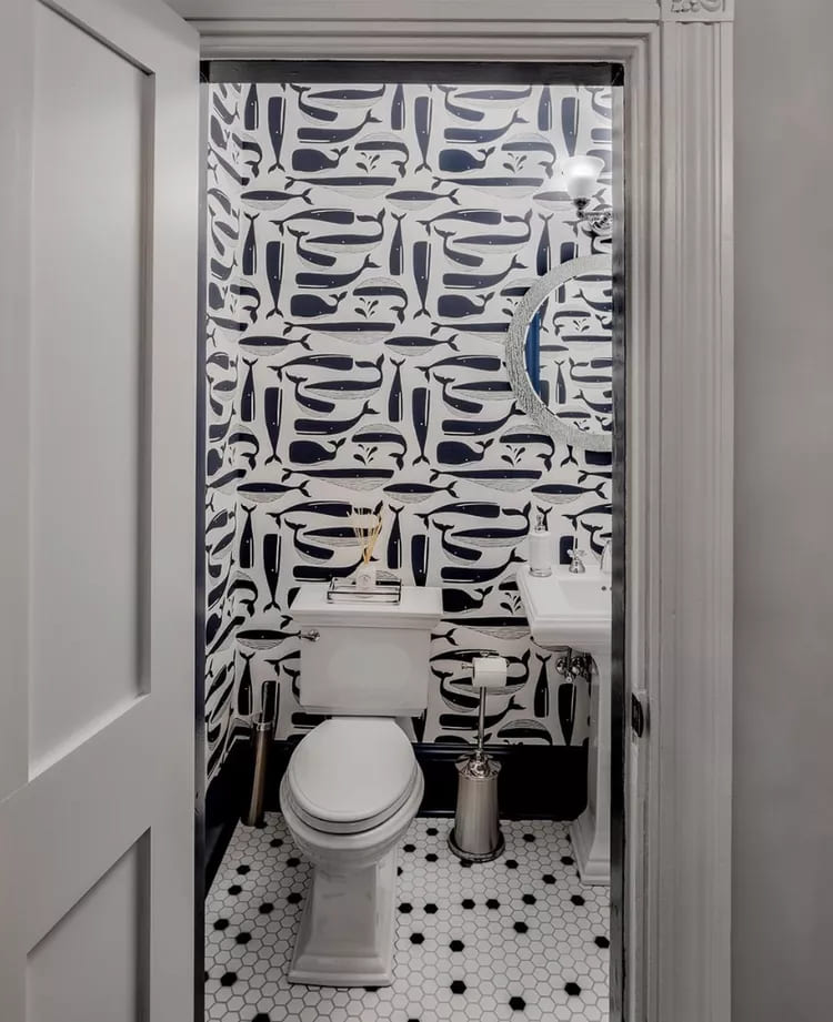
Evoking smooth stones and calm waters, this combination is perfect for bathrooms or meditative spaces.
9. Celestial Blue and Neutral Gray
This blue palette with gray it brings a feeling of clear sky and soft clouds, ideal for bedrooms and resting areas.
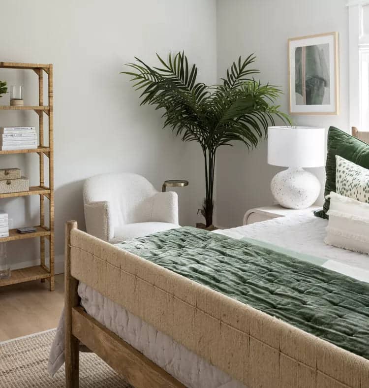
10. Ocean Blue and Moss Green
This combination evokes the feeling of the forest meeting the ocean, creating a balance between land and water.
11. Earthy Tones and Pool Blue
The combination of browns and bright blues is reminiscent of natural pools found on hidden beaches.
12. Coral Red and Mermaid Blue
One online color palette vibrant that is reminiscent of coral reefs and the mysterious depths of the ocean.
13. Pure White and Mediterranean Blue
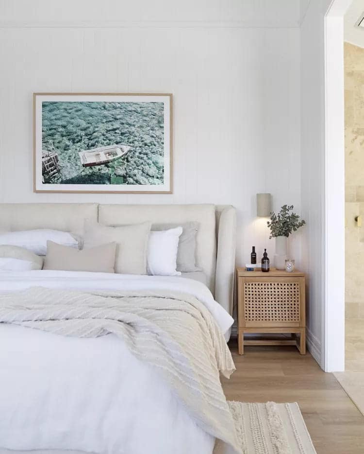
This timeless combination brings a sense of peace and tranquility, reminiscent of the beaches of the Mediterranean.
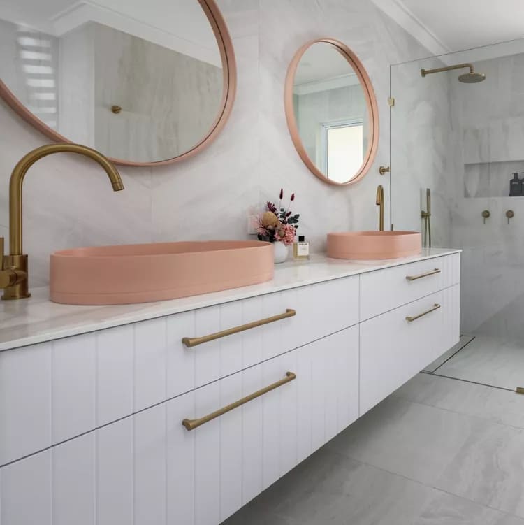
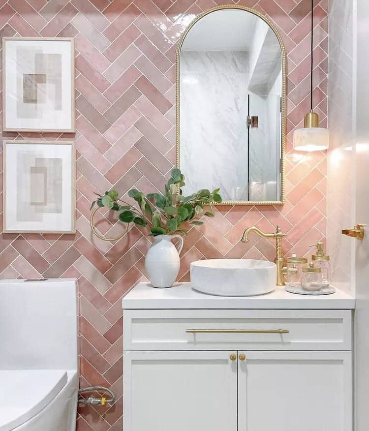
14. Faded Pink and Ocean Gray
A soft feminine touch combined with the serenity of the grey ocean, perfect for a bedroom or office.
15. Aqua and Ivory
This soothing combination evokes the feeling of shallow waters found in tropical lagoons.
16. Rocky Gray and Forest Green
Reminiscent of seaside stones and coastal vegetation, this combination is perfect for living areas.
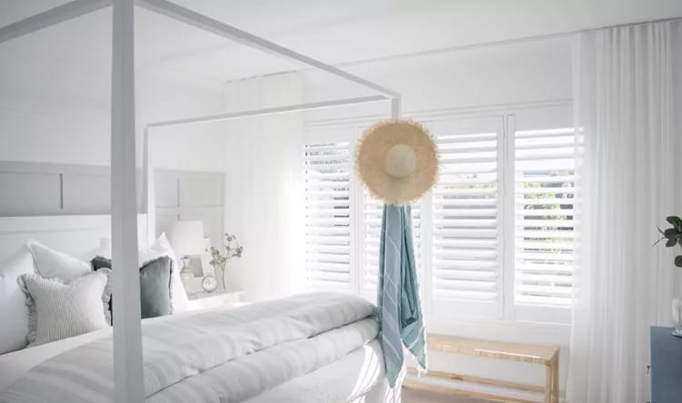
17. Glacial Blue and Cloud White
One blue palette that brings the feeling of the sky meeting the ocean on a clear day.
18. Dawn Pink and Dusk Blue
Reminiscent of the sky at dawn, this combination is serene and romantic.
19. Citrus Orange and Tidewater Gray
One color palette vibrant and fresh, ideal for kitchens or dining areas.
20. Avocado Green and Coastal Blue
This combination brings the feeling of tropical vegetation meeting the blue sea.
21. Desert Pinks and Sapphire Blue
A combination that recalls exotic beaches with pink sands and deep waters.
22. Sky Blue and Cotton White
A breezy combination reminiscent of a perfect day at the beach, with clear blue skies and fluffy white clouds.
23. Emerald Green and Navy White
One color palette that evokes the brightness of the sea under the sunlight, contrasting with the white foam of the waves. So, with these combinations, you can create color palettes that bring the beach feel to any space. Whether in the living room, bedroom or any other room, the possibilities are endless and the inspirations are as vast as the ocean.
Did you like this amazing content? If so, share it with your friends and on your social networks. See exclusive and free content daily on our website. Blog of ideas and tips and take the opportunity to follow our Google News Channel. Thanks!