
The colors that go with red, a topic that for many may seem like a challenge. But we're here to show you that this challenge can be transformed into an incredible opportunity to renew and energize your home decor! When used well, the color red has the power to bring life, energy and personality to any room.
If you want a vibrant and cozy space, choosing colors that harmonize with red can be the key to achieving that goal. In this guide, we will explore several color combinations that stand out alongside red, covering everything from the most classic combinations to the most daring ones. Let's get started!
Red: The Color of Dynamism and Passion
Red is a color that does not go unnoticed, whether for its symbolism of warning, passion, or strength. Its vibration evokes intense emotions, which vary according to the cultural context. For example, in China and other Asian countries, red symbolizes joy, prosperity, and longevity, and is even used in wedding dresses. In India, it is associated with spirituality and sensuality, while in some African countries, it represents death.
Red is known to awaken the nervous system, increasing heart rate and blood pressure. It can stimulate feelings of energy, excitement, and even aggression, but it can also convey warmth, love, and sensuality. With such versatility, red is often associated with passion, romantic love, and characteristics such as courage and determination. And in decoration, red can take on any of these attributes, depending on how it is used, the shades applied, and the other colors in the palette.
Colors that Harmonize with Red
Red is a color that usually dominates decor, even when it appears in a single element. Although neutral colors are a safe option to combine with red, let's explore other interesting possibilities:
- Red and White: This classic combination presents a strong contrast, with the white further highlighting the intensity of the red. The duo brings a sense of energy and looks great in both classic and modern decors.
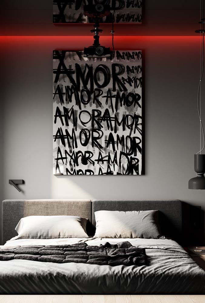
- Red and Black: This powerful and elegant combination intensifies the vibrancy of red, conveying a sense of sophistication, mystery and luxury.
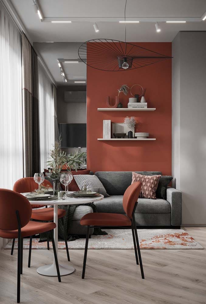
- Red and Gray: With a modern and sophisticated feel, gray softens the intensity of red, offering a more subtle and elegant contrast.
- Red and Yellow: For those seeking joy and energy, red and yellow form a vibrant palette, conveying enthusiasm, fun and creativity.
- Red and Green: Together, they create a powerful contrast, revealing personality and creativity. But be careful with the proportion between the colors to avoid a caricatured decoration.
- Red and Blue: This combination conveys vibrant energy, making it perfect for creating modern, youthful and elegant environments. The contrast between the freshness of blue and the vivacity of red creates a unique and personal decoration.
- Red and Beige: For those looking for a less intense contrast, beige is an excellent option. It tones down the power of red and adds a more rustic and cozy feel to the space.
- Red and Brown: A combination that brings naturalness and warmth, perfect for those looking for a relaxing atmosphere. Adding wooden elements can intensify this feeling.
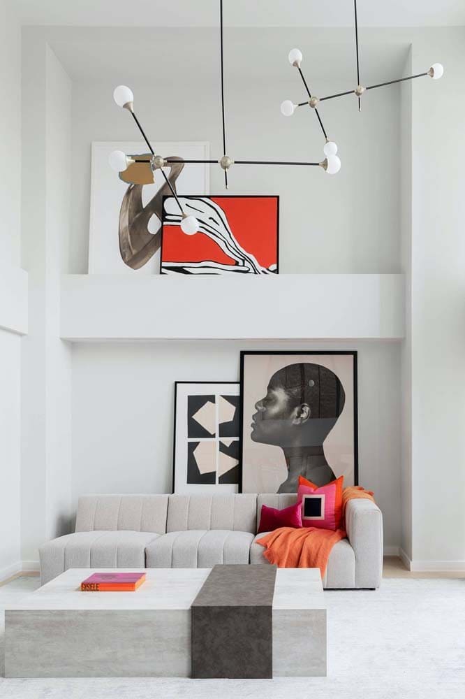
- Red and Pink: A low-contrast, yet intense and passionate combination, ideal for bedrooms and social areas.
How to Combine Colors in Decoration: Tips for Laymen
For those who are just starting to explore the world of decoration, combining colors can seem like a difficult task. However, there are some tips that can help:
- Choose a Main Color: In our case, it's red. This will be the color that sets the tone for the rest of the decoration.
- Use the 60-30-10 Rule: To balance the colors in your space, try to follow this ratio. 60% of the room will be decorated with the main color, 30% with the secondary color and 10% with an accent color.
- Use Complementary Colors: These are colors that are opposite each other on the color wheel. In the case of red, the complementary color is green. This combination creates a contrast that is pleasing to the eyes.
- Test the Colors First: Before painting an entire wall or buying furniture, test colors on small areas to see how they work together.
- Use Tone Variations: Using different shades of the same color can add depth and interest to a room.
With these tips, we hope you feel more confident about exploring color combinations in your decor, and that red becomes a great ally when it comes to creating original spaces with lots of personality. Remember, the most important thing is that the space reflects your taste and makes you feel good!
The art of playing with red in decoration
Red. A warm, vibrant, bold and yet classic color. Anyone thinking of being a little more daring in their decor will soon find it to be one of their first options. But how can you use red to achieve balance and not overwhelm the space? Let’s explore this colorful universe and discover the colors that go well with red, creating a unique space with personality and lots of charm.
Red as the Protagonist: Putting the Focus on the Heart of the Environment
A harmonious environment does not necessarily mean monotonous colors. In fact, the charm of decoration often lies in contrast. Red, with its striking presence, has the ability to stand out and become the focal point in a neutral environment. Imagine a space decorated predominantly in shades of gray or beige. Now, add a red element, such as a sofa. The eye is immediately drawn to it, and the space takes on a new dynamic. This is the power of contrast in action, bringing a bold and attractive balance.
Red in Profusion: Boldness and Avant-garde in Decoration
Maybe you’re someone who loves the impact of red and wants to explore this vibrant color even further. Why not take the plunge and paint an entire room red? It may seem a bit daring, but when done correctly, it can result in an avant-garde space full of personality. However, it’s important to remember that when choosing this option, the design of the furniture and objects should be more minimalist. This way, you avoid visual overload and ensure that the intensity of the red is the star of the room.
Red Touches: Details that Make a Difference
If your style is more restrained, but you still want to include red in your decor, small details can be the solution. Strategic touches of red can bring a touch of warmth and liveliness to the room without overwhelming it. Think about red pillows on the sofa, a rug with red accents, or even a lamp in this color. These subtle touches can bring the personality you are looking for, without compromising the visual balance of the room.
Complementing Red: Colors That Go Well Together
Combining colors is an art and, when done well, can transform a space. So, what colors go with red?
- Red and Gray: Gray is an elegant neutral color that provides a beautiful contrast to red. It allows the vibrant color to stand out while maintaining a sophisticated feel.
- Red and Green: For the more daring, red and green can be an intriguing combination. These complementary colors create a bold composition, full of energy and life. Perfect for those who want to bring a more lively and cheerful aesthetic to the space. Remember, however, that balance is key: opt for softer tones or use these colors in small details to avoid an overly intense atmosphere.
- Red and White: This is a classic combination that never fails. White provides a clean slate for the red, allowing it to really shine. Plus, white brings lightness and freshness, balancing out the intensity of the red.
- Red and Black: For a more dramatic and sophisticated aesthetic, try pairing red with black. It’s a bold combination that exudes elegance and style. However, it’s important to be careful not to make the room too dark. Add elements in lighter tones to create contrast and brighten up the space.
- Red and Wood: For a more rustic or cozy look, there’s nothing better than combining red with wood tones. The texture and warmth of the wood soften the intensity of the red and create a warm and inviting atmosphere.
Remember: In decoration, rules can and should be broken to reflect your personal taste. Red, with its versatility and presence, is a great ally for those looking to bring personality to their space. So, experiment, play with combinations and find out which one speaks most about you.
Shades of Red: A Palette of Options
We cannot forget that within the red universe, there is a variety of shades that can be explored, from cherry red to burgundy, each one offering a unique atmosphere and feeling. Carmine red, for example, brings a tone of luxury and sophistication, while coral red brings a touch of modernity and freshness.
Choosing the right shade of red for your space will depend on the atmosphere you want to create. It’s important to keep in mind that colors don’t work alone, but rather in conjunction with other elements in the room, such as lighting, furniture, and accessories.
Conclusion
Decorating is a form of expression, and red is a color that certainly makes a statement. Whether you choose it as the star, as a detail, or as part of a larger color palette, red has the ability to transform a room and bring personality to your space.
Whether you’re bold or restrained, the important thing is that your decor reflects who you are. Remember, your home is your sanctuary, and decor is the way to make it truly yours.
Did you like this amazing tip? If so, share it with your friends and on your social networks. Leave your comment below and your suggestions. Receive it daily here on our website. Blog of ideas and tips free and follow us on Google News too. Thank you!