
Hello! Today I want to share with you my experiences and insights on a charming trend in the world of decoration: the use of a gray color palette. The color gray, often seen as basic or neutral, can transform any space with a touch of elegance and modernity. Let's explore together the top 53 trends using this fascinating palette.
How Undertones and Temperature Make Choosing Colors Easier
To create the color scheme To create a perfect color, especially when it involves paint, it’s helpful to know a little about hues and color temperatures. You don’t have to become a color expert, but you can save time by recognizing the subtleties of colors and how they work together.
- Undertones: Unless they’re pure or primary colors, the colors you see in paint and decor are mixed with other colors. Undertones appear when one of the colors in the mixture is recognizable. This mixture can completely change what you thought was a neutral color. One designer’s secret to choosing paint is to look at the name of a color to see if there’s a clue to its undertone; often it’s right there in the name.
- Color temperature: Colors can be warm or cool and can affect your palette. Warm colors are energetic and can seem to push forward in a room, while cool colors are more passive and can recede into the background. Gray can be mixed with cool blue or warm brown to change its color temperature.
Cool gray color palette
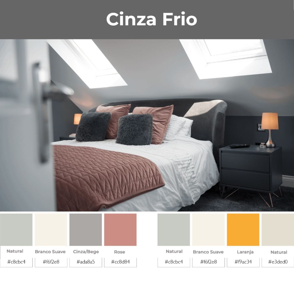
Gray, in its original formula, is simply a mixture of black and white. For interior design uses, the colorsgray colored eta popular ones can have blue or green added to give them an updated look while staying true to their cool nature. It's easy to create a color scheme with cool grays, as they work with all types of tones, from dark to pastel.
Warm Gray Color Palette
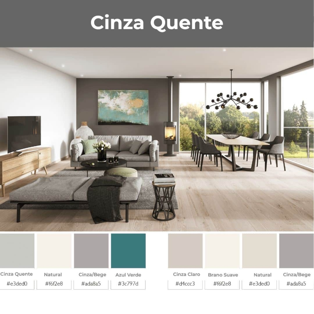
Warm grays exploded in popularity in the 1990s and have become a fixture in the decorating world. The versatility of these calming neutrals makes them an easy choice for both interiors and exteriors. Warm grays are often referred to as beige with gray, which is a play on words beige and gray. By adding a warm brown tone, the beige with gray becomes the most versatile neutral color because it can be combined with cool or warm colors in a gray color scheme.
Gray color palette for furniture
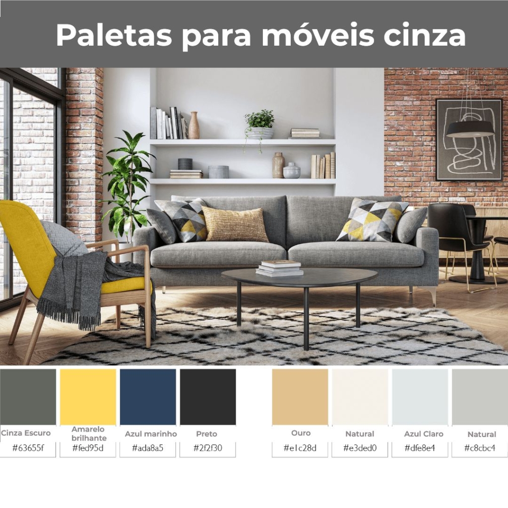
Gray has overtaken brown and beige as the most popular upholstered furniture color. With the popularity of wood and hardwood flooring, gray furniture adds definition to a space and brightens up a room.
How to combine gray with pastel colors
In most cases, pastel colors can be difficult to pair with neutrals. The muted nature of pastels can clash with warm colors or get lost in a color scheme.
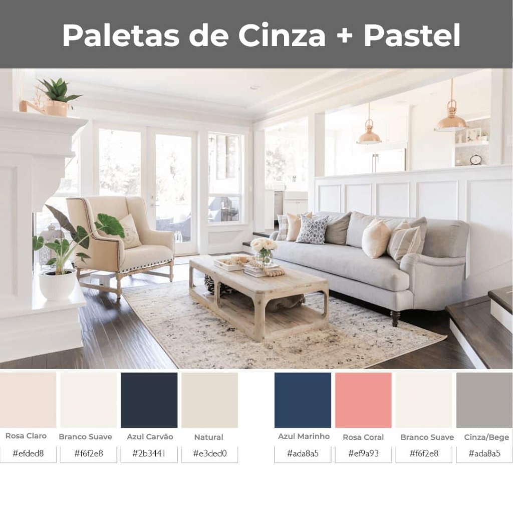
The right neutral gray can make light colors pop while keeping them looking fresh. The secret to creating a gray color palette With pastels it's all about choosing the right shade of gray. You want to have a clear distinction between the colors, which means a mix of dark and light.
Versatile Charcoal Gray Palettes

When you’re looking for a color to anchor your palette, charcoal gray is a must-have. Charcoal is sophisticated, like black, but the slight difference in its undertones keeps it from looking too formal or formal. You can pair charcoal with any color palette, instead of black or dark brown. Charcoal is the perfect base for a monochromatic color scheme, which is not only relaxing but super sophisticated with warm metallic gold accents.
Choosing the right color palette
There are simple steps you can take to ensure you choose the best gray color palette for your home. Knowing what mood you’d like to create in the space is an important first step, and using inspirational photos online is an easy way to get started. Collecting paint chips and fabric swatches can help you match colors in real life, and sampling paint on your walls is essential. The most important consideration in creating any color scheme It's personal taste and surrounding yourself with colors and decor that you love is the most important measure of decorating success.
53 Inspirations using Gray Color Palette in Home Decor!
Let’s be honest, the gray color palette gets a bad rap for being a dreary shade. A middle ground between black and white, gray is often used as a subtle accent color. Here are some ideas we’ve put together to help you get inspired and thinking:
01 – The gray color palette is used as a soft and subtle alternative to white or cream.
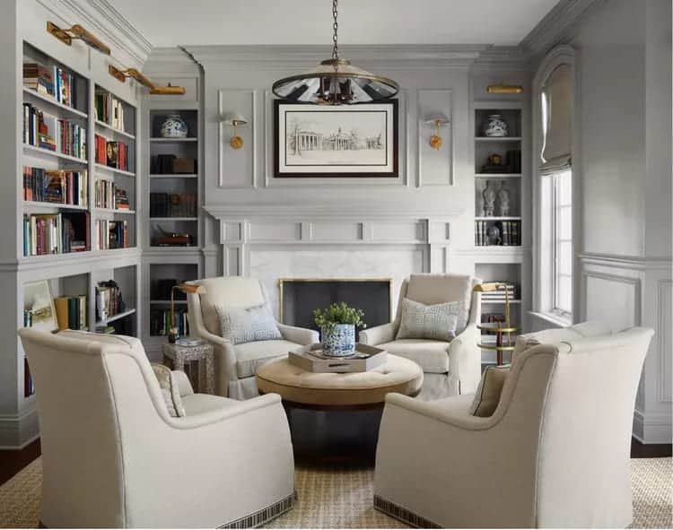
This classic living room design proves that these tones can be used together, giving the room an air of sophistication and modernity in what is usually a traditional suburban setting.
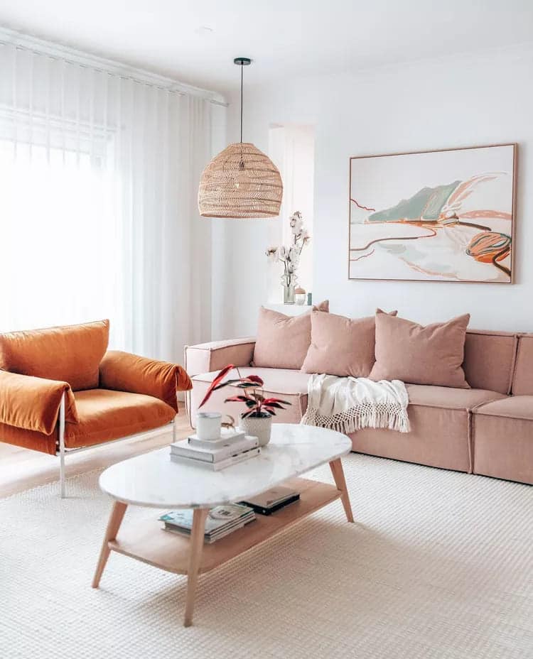
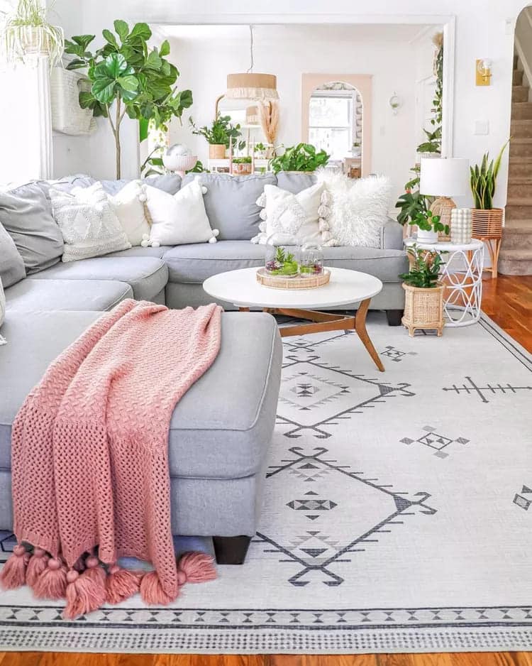
02 – You don’t need to use one palette of dark gray color and make a perfect decoration.
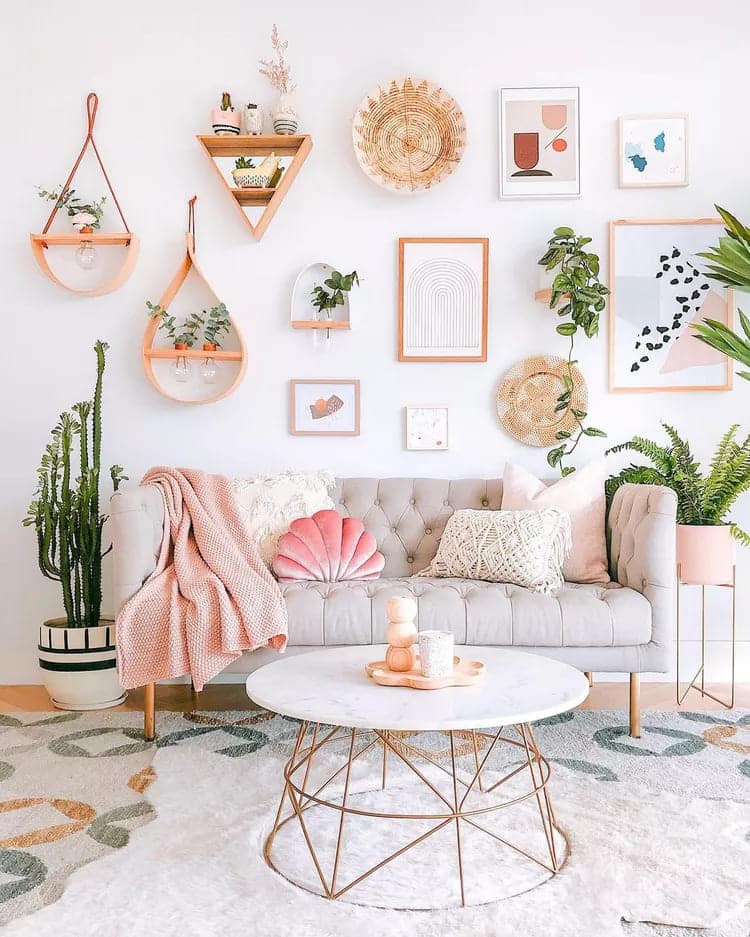
A light and airy environment was created here, combining a sofa A two-seater with pale pink accents and a white coffee table in this living room. A patterned rug in shades of pale orange, blue and gray completes the look, proving that subtlety never goes out of style.
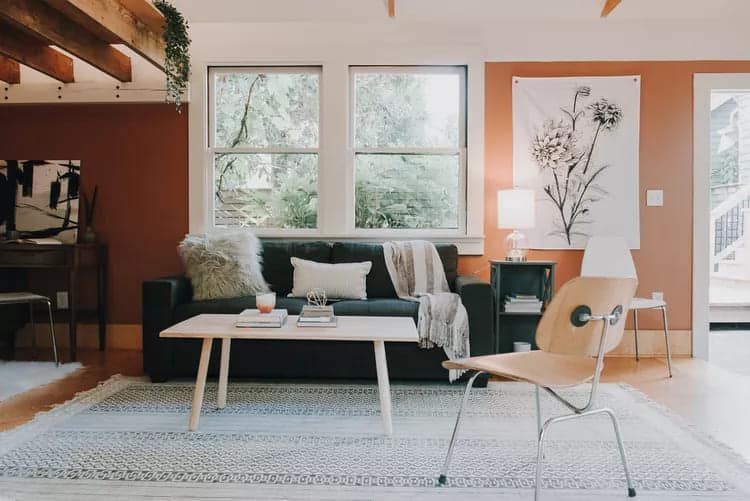
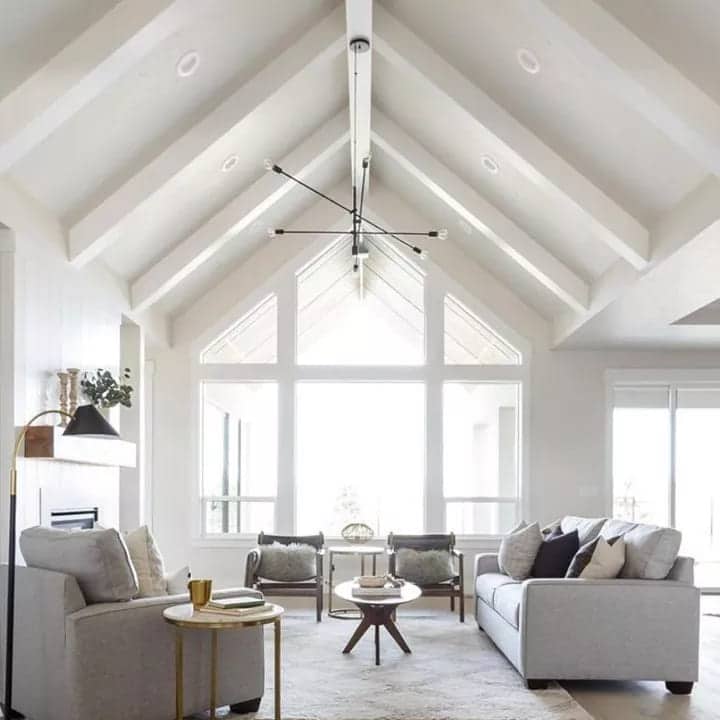
03 – We’re loving this elegant living room. If you’ve ever thought about painting your ceiling beams, let this be your inspiration.
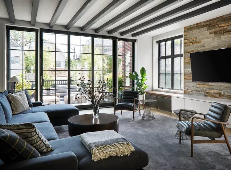
The gray paint adds depth and provides a nice sense of contrast to the white walls and ceiling, just dark enough to highlight the beams without overwhelming the room. Thanks to a gray rug, the ceiling beams feel intentional and blended into this space.
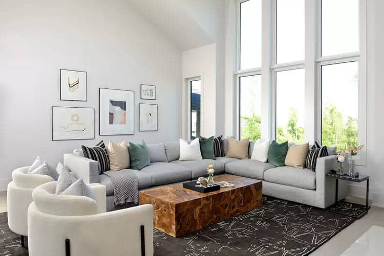
04 – As evidenced by this living room, palette of color Gray and white are a match made in decorating heaven.
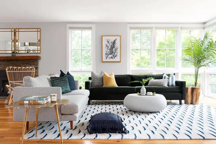
While you might think an emerald green sofa would be a no-holds-barred pop of color, give this piece of furniture a more subtle approach by pairing it with gray walls.
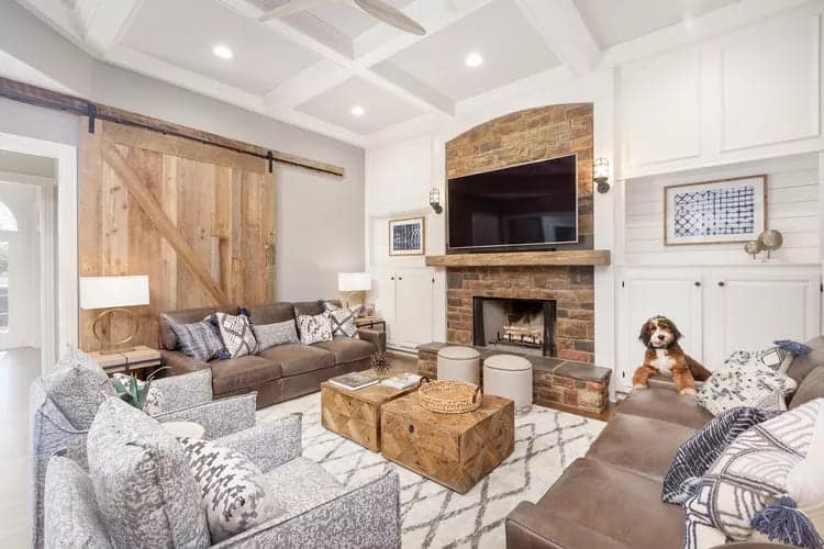
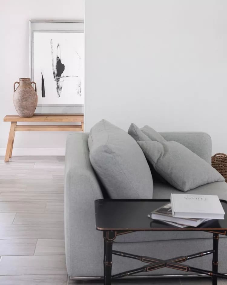
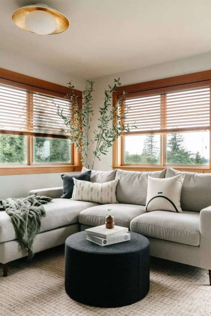
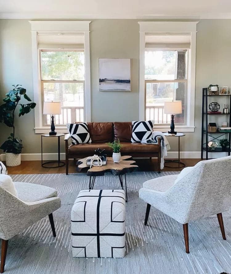
05 – Want to add dimension to your space? Follow the suggestion and combine your gray tones with lots of textured details.
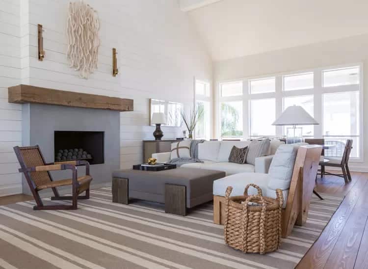
The quickest way to liven up a gray living room is with dynamic textures and materials. Straw baskets, knitted throws and pillows, sculptural artwork, and even unique architectural details will give your gray living room an effortlessly chic vibe.
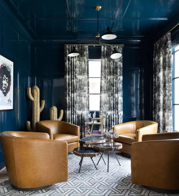
06 – Find a balance between subtle and striking by mixing gray with a bold shade, like fire engine red.
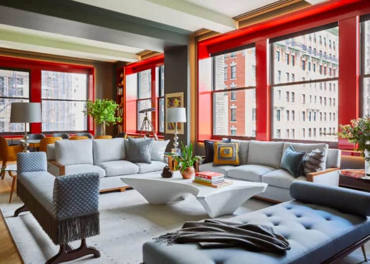
Uma sala de estar vermelha pode parecer intensa, mas suavizar o visual com uma pequena parede de detalhes em cinza e sofás cinza claro. Esta configuração apenas emite uma energia tão sofisticada.
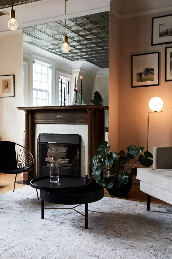
07 – This space is a lesson in minimalism where less is more becomes predominant.
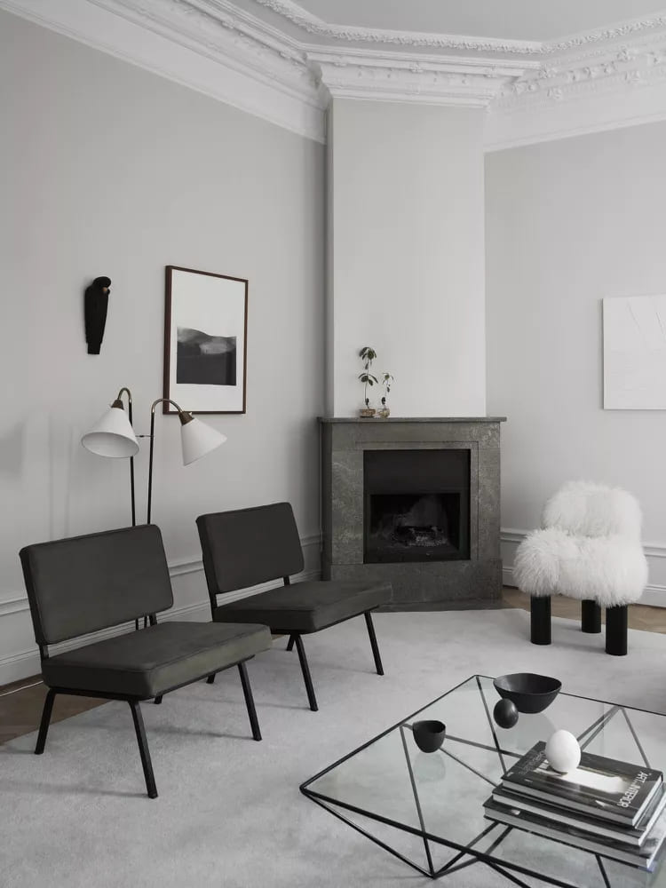
Mixing monochromatic grays and skipping accent colors altogether. Hardwood floors bring just the right amount of warmth to the design, while matching textures, from the marble fireplace to the leather chair, make the dynamic space visually interesting.
08 – It turns out that gray looks absolutely fierce with earth tones.
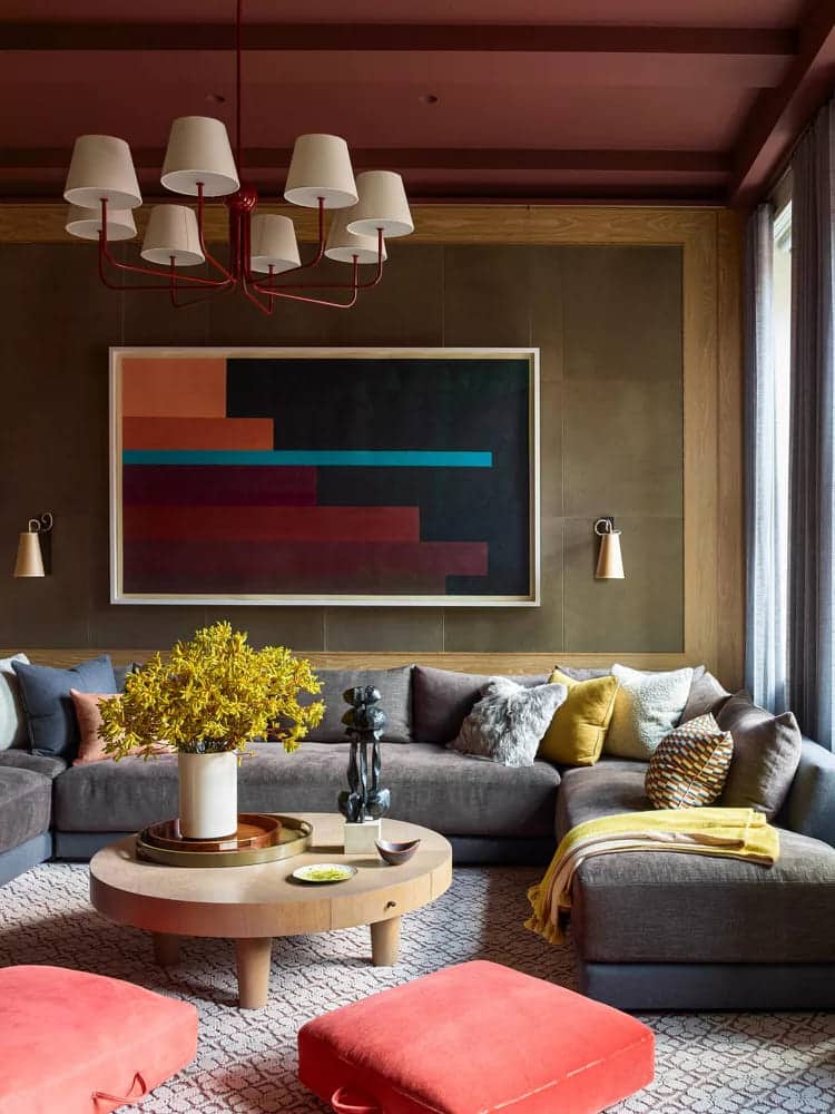
Take a look at this living room, a sofa Gray combined with olive green walls, a reddish-brown ceiling and yellow pillows and blankets, mimicking a lush forest. When all these earthy tones are combined, they create a living room that is sad but full of personality and life.
09 – If you want to decorate with orange but are worried that your home will end up looking like a Halloween haunt, add a little gray to the mix to keep things realistic.
In this cozy living room, a green sofa was used and tangerine-colored walls were applied. Fluffy pillows and a patterned rug in lighter shades of gray soften the color palette contrasting.
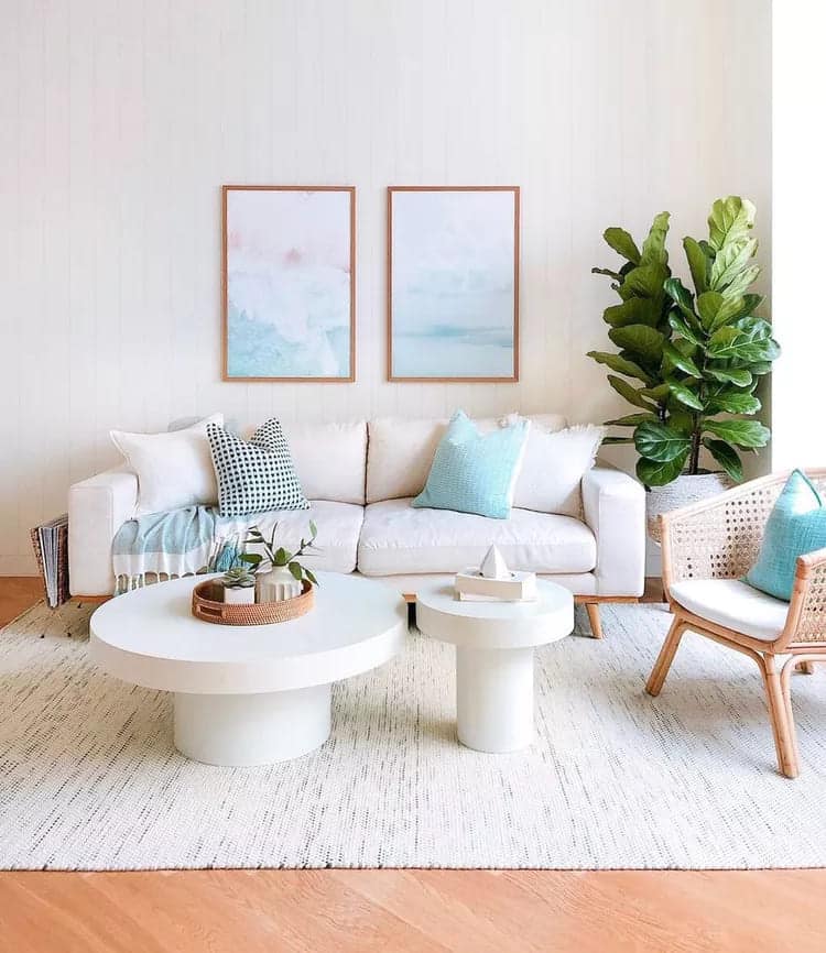
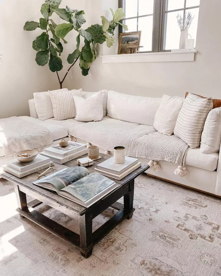
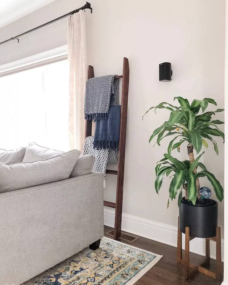
10 – If you’re going for a gray living room but don’t want to mix in too many accent colors, keep it simple by adding fresh plants.
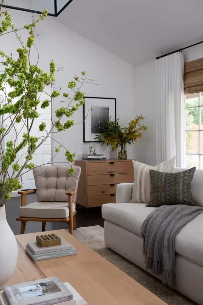
This design trick is a great way to liven up your home without compromising its clean aesthetic. Here, large branches with lush green leaves create a focal point on the coffee table. In the corner of the room, soft colors pop in the stylized leaves in a vase of transparent glass over the wooden chest.
11 – Want to have a total wow moment with gray? Paint an accent wall.
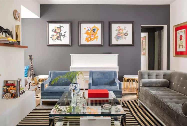
This living room with a moody charcoal statement. When surrounded by light white walls, this palette of gray color it looks dramatic, but not as drastic as, say, a dark black.
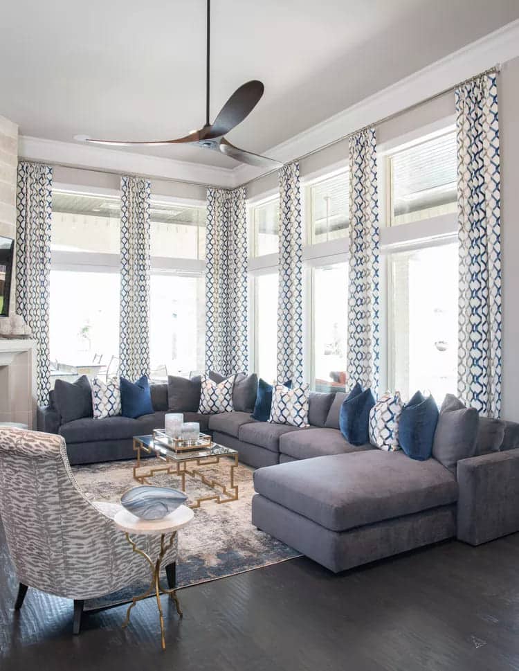
12 – Anyone who wants their living room to feel fresh should consider combining gray with blue.
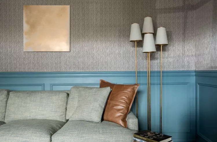
With gray herringbone wallpaper, a coordinating gray sofa, and sky blue wainscoting, this space is equal parts comforting and striking. This palette will instantly put you at ease without feeling like a snooze fest.
13 – Gray is a perfect base for any aesthetic, as it is incredibly adaptable.
To create a warm and welcoming space that still feels fresh, combine a leather sofa and sliding barn-style wooden door.
14 – Here bold details were applied to this living room through a gray wallpaper patterned with light shades of blue.
A floor lamp anchors the furniture to the walls, while a jewel-toned sofa becomes the focal point with velvet upholstery. Natural tones in the fabric cushion set a backdrop for the bright, patterned pillow to rest on.
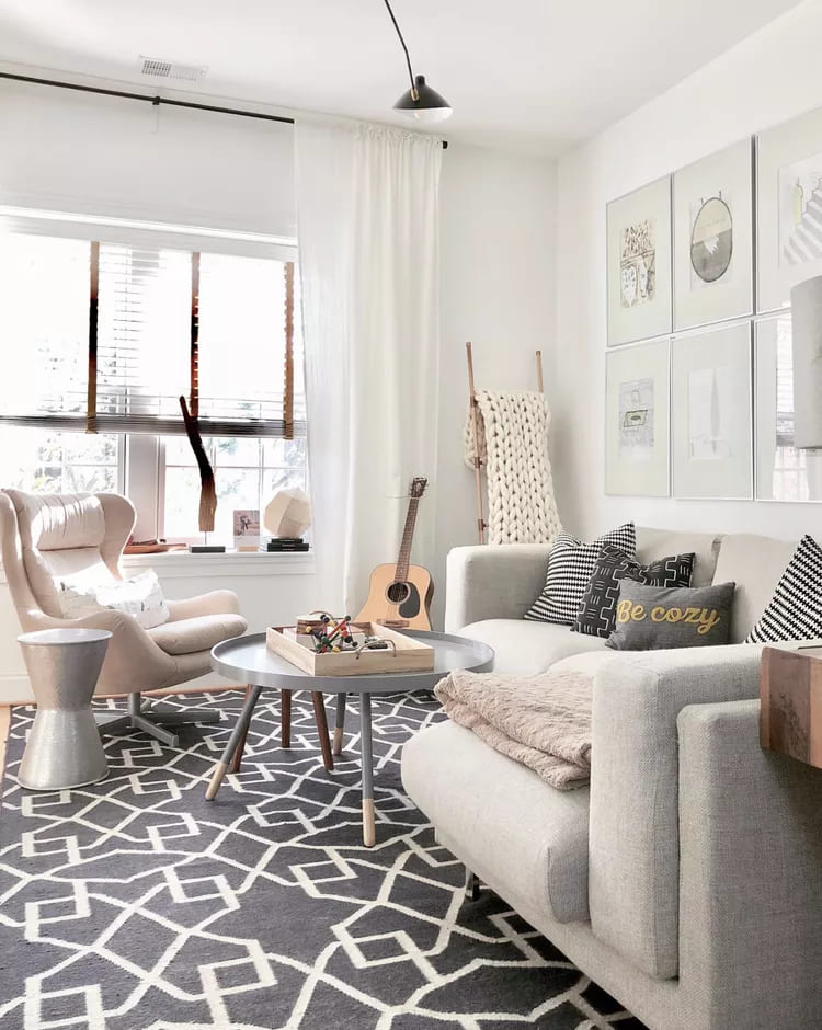
15 – What’s black, white and chic all over? This living room, although black and white, is a timeless color combination, can seem a little jarring.
Luckily, the room is high contrast with various shades of gray to tie the colors together. A dark gray sofa, with matching pillows and an area rug make the space feel softer.
16 – If you’re not ready to commit to gray paint and furniture, follow this suggestion.
Style the color in your space with a large rug. This living room feels clean and fresh with white walls and accent chairs, but subtle gray tones on the floor and marble fireplace add depth to the design. We love the use of neutral colors with a custom mid-century wood accent wall to complete the space.
17 – If you’re working with an open concept design, opt for a theme that ties each space together with consistency.
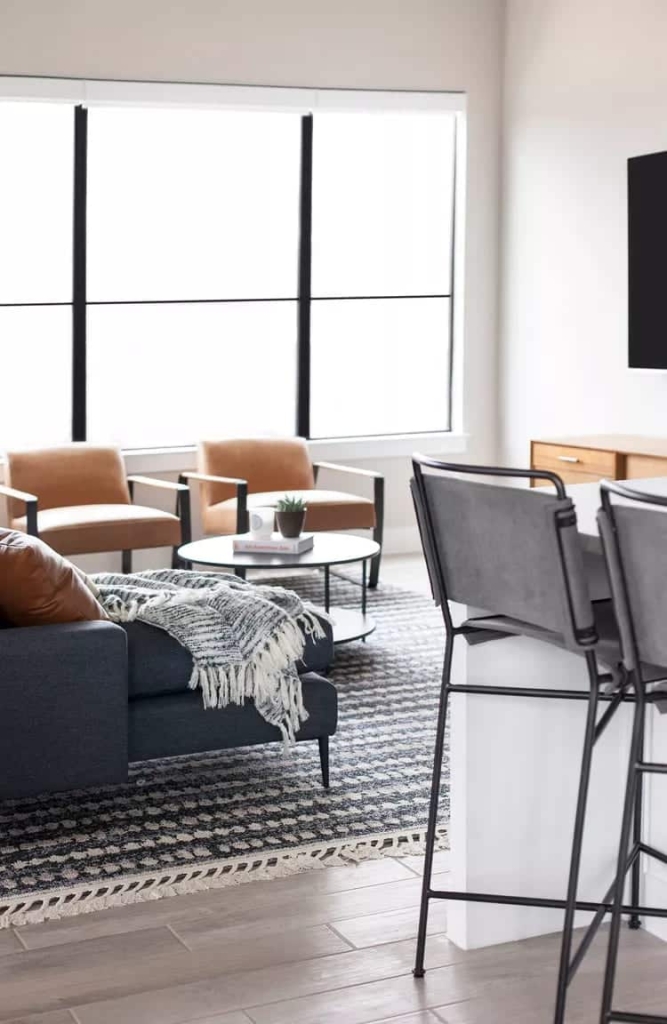
In this open living and dining area, the gray theme continues. Gray bar stools are paired with gray accents in the living room rug and throw for a clean, simplistic look.
18 – If you want to mix several bright colors in one space, paint your walls gray.
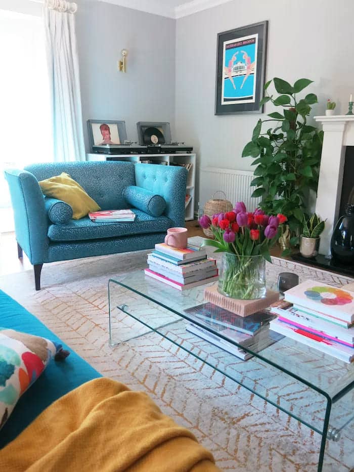
Essa tonalidade adiciona nuances extras ao seu quarto, fazendo com que as cores ousadas pareçam intencionais. Deixe esta alegre living room show how it's done with subtle gray walls and bright blue seating that just works.
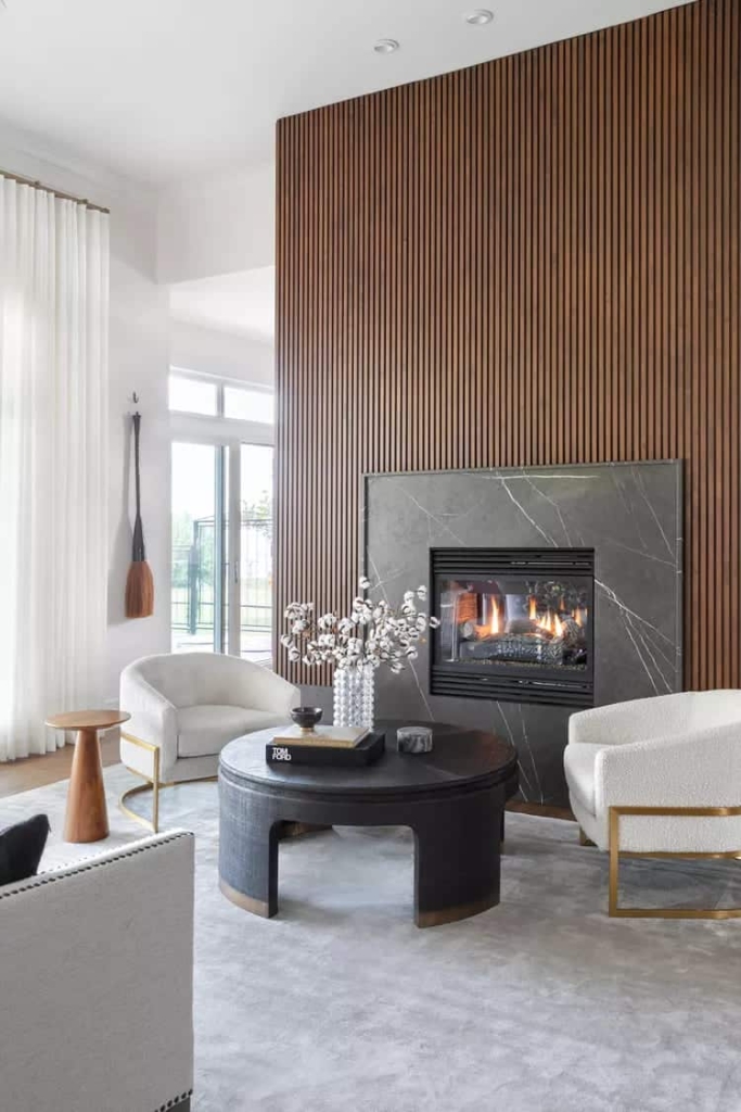
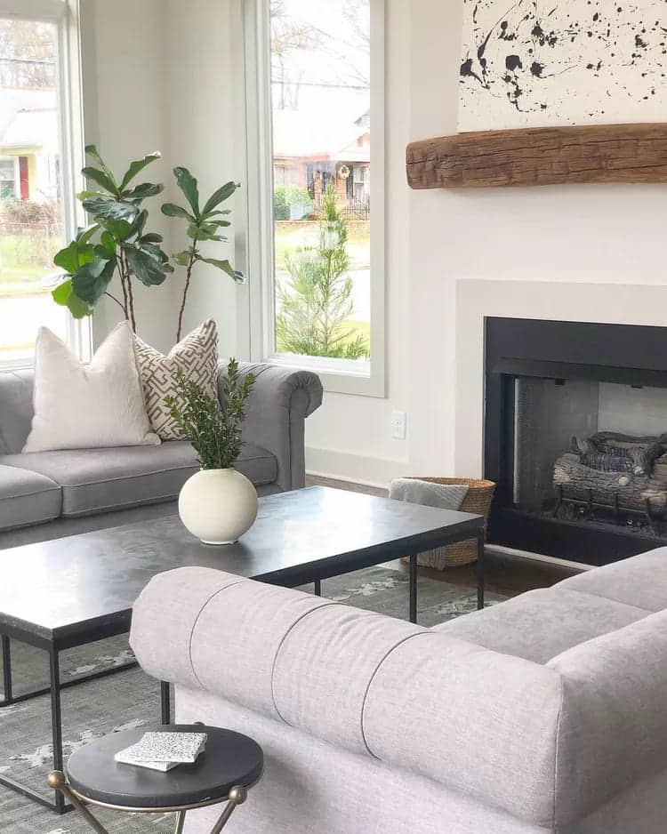
19 – When the temperature drops, your fireplace will become one of the most beloved parts of your entire home, so it’s best to keep it there.
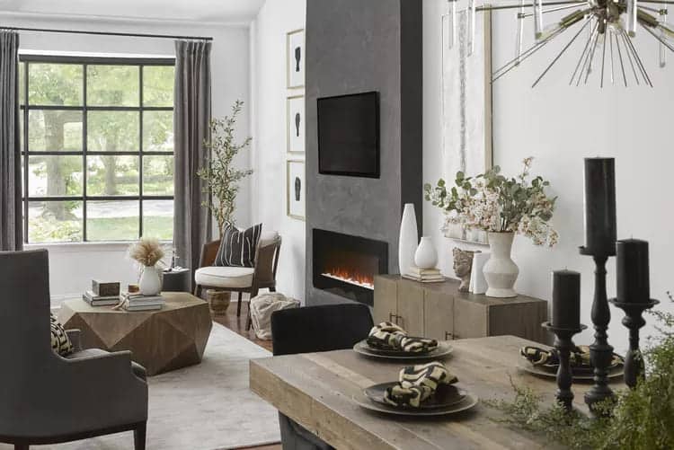
We love how it is living room reinvents the fireplace with a minimalist, fresh textured slate. The sliver of color makes a statement, but isn’t as bold as a full-on accent wall.
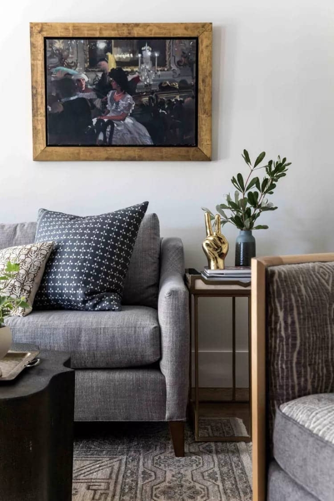
20 – To add warmth and sophistication to your monochromatic gray living room, simply add touches of gold to mix it up.
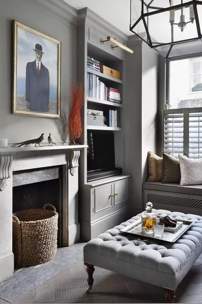
This design gave a traditional space a modern twist with a thin gold frame paired with brass accents. Finished with a whiskey decanter, engraved glasses, and an oil painting, this space strikes a stunning balance between old and new.
21 – This living room is proof that minimalism can still pack a lot of personality.
This airy living room design pairs gray hardwood floors with an upholstered sofa for an inviting, lived-in vibe. The key is in the details: the dark colors from the floor baskets to the side table bring contrast to the room, adding depth.
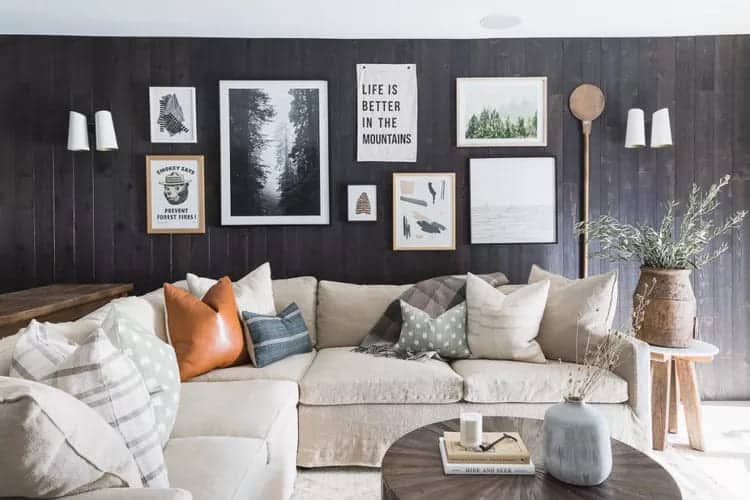
22 – If you want to revitalize your gray living room, surprise yourself with a stylish wall with pictures.
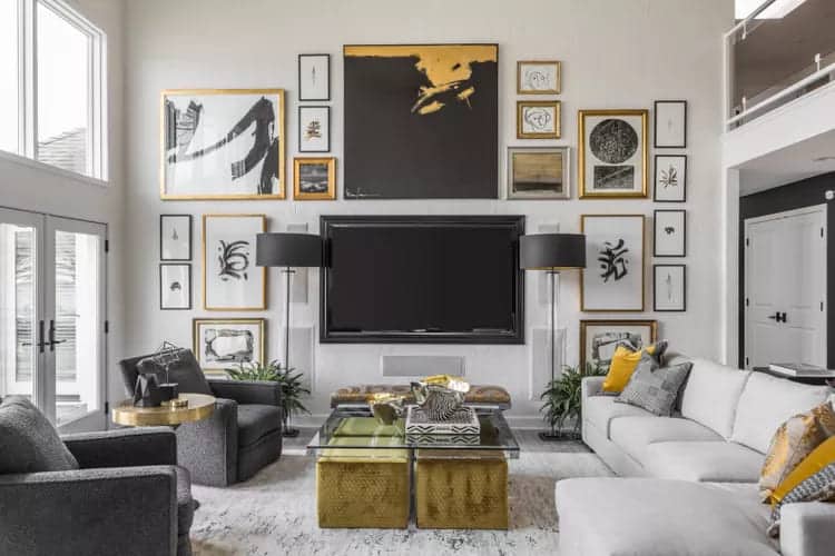
The good news is that if you’ve got a gray color palette as your base color throughout your home, you have a blank slate to play with. Gold picture frames and mustard accents give this space an eye-catching edge.
23 – Give your living room a relaxed look by mixing gray with neutral tones like cream, black and brown.
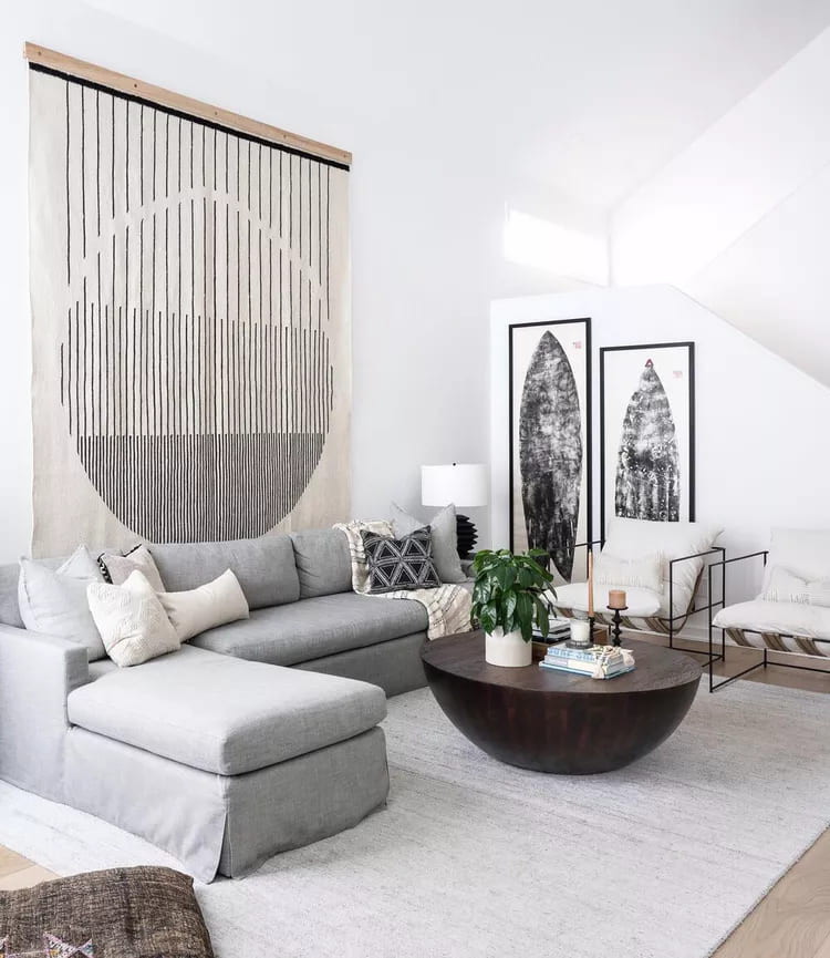
This space features a versatile wooden coffee table, deconstructed armchairs, and a massive tapestry. Anchoring the entire room is the gray sofa, providing the perfect midpoint between the room’s light and dark tones.
24 – In case you didn’t get the memo, painting your walls isn’t the only way to get creative with your decor.
A versatile hue was taken to new heights by covering this ceiling with a burnt cement treatment in a light gray color palette. Layered with blue and wood furniture and blush artwork, this room looks good from every angle. After all, the only way to go is up.
25 – If you want to up the ante in your gray living room, incorporate thoughtful patterns.
With a textured gray sofa, patterned pillows, and patterned rug, this living room is a masterclass in layering graphic prints. With monochromatic colors and small-scale prints, the living room feels opulent but not over the top.
26 – When it comes to painting your walls, white might be the ideal shade.
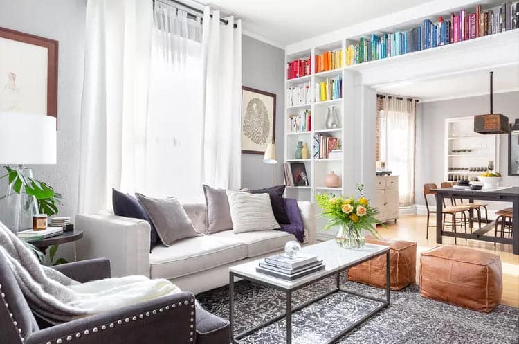
However, white walls can run the risk of looking dull. Create a warm and inviting atmosphere by lining the walls with a soft gray color palette and then grounding the room with a slightly darker gray rug. From the built-in bookshelves to the pops of forest purple, this living room It's incredibly cozy and chic.
27 – Why settle for one palette of color gray when you can mix several?
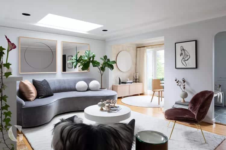
While it doesn't quite make it to 50 shades, this decor offers a look by pairing its light gray walls with a gray sofa curved and sculptural stone details.
28 – Natural materials like leather and wood are perfect choices to bring some warmth to your gray living room.
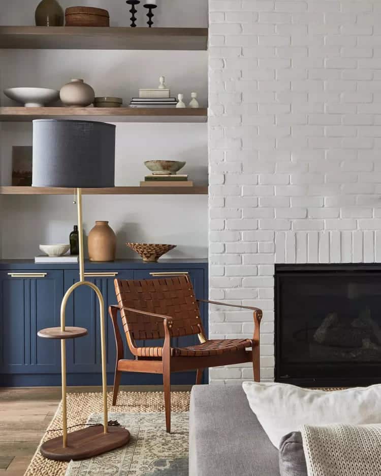
In this living room, a woven chair pairs well with gray accents in the light fixture and soft wall color. Thanks to the deep blue built-in cabinets and gold hardware, this gray design feels anything but somber.
29 – For a soft, relaxed look, match the paint on the wall to the color of the furniture.
Monochromatic tones in the pillows keep the space feeling intentional while adding a touch of visual interest and depth.
30 – In this living room, an off-white tone with gray on the walls stays consistent with the light and airy style.
The paint color is paired with pink accents that tie the sofa and wall art together for a warm pastel vibe. The marble coffee table contrasts the white with similar gray tones to complement a light area rug.
31 – This inviting space features warm tones on the walls and furniture, but a gray ceiling brings metallic details to the room.
Decorated with similar tones on the chair and area rug, the ceiling stands out to make the neutral colors of design blend together. We love the combination of vintage decor and modern that creates an eclectic vibe with a lot of unique character.
32 – Chosen monochromatic colors in this space, and the color palette is worth using.
By opting for white paint on the walls, the idea achieved a bright, minimalist vibe while incorporating the dark decor. Black and white patterns on the cushions complement the area rug, while a gray coffee table brings balance to the center of the room.
33 – The shades of gray certainly don’t look full in this living room
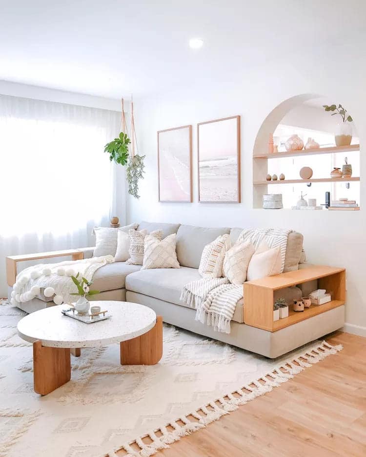
The decorative touches warmed up the space by combining light walls and furniture with natural details, from the wooden arms of the sofa to the shelves in the arch. To complete the design, live plants bring a touch of color to the room.
34 – To make your gray walls stand out, use a bright white paint on the skirting board in your living room.
Yarn created a lot of depth in this room by mixing neutral tones throughout the room that included: plush pillows, woven baskets, and a cozy rug stand out against the gray walls. A modern leather sofa serves as the focal point of the room, bringing warmer tones to the fresh, airy design.
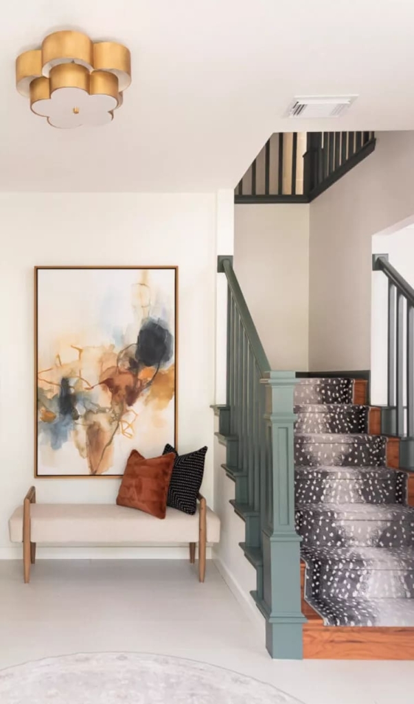
35 – This decor feels complete thanks to the layers of gray from floor to ceiling.
By styling a modern gray chandelier with similar tones in the furniture and rug pattern accents, the neutral color is apparent throughout the room without overpowering its blue statements.
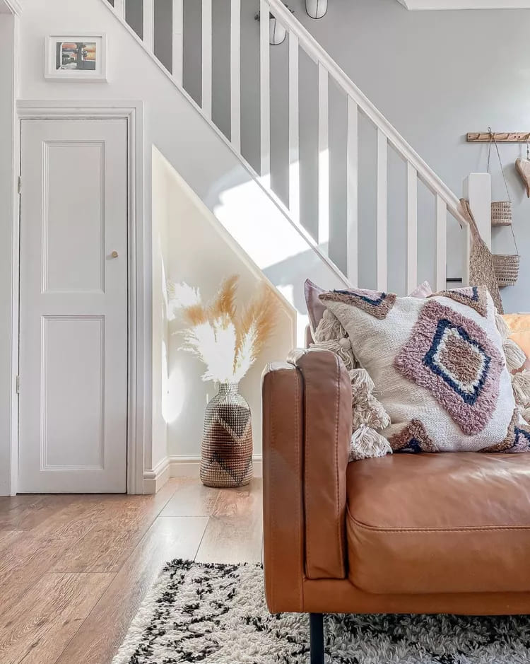
36 – In this living room, open to the staircase, gray details from the rug to the staircase join together.
Opt for natural fur-inspired materials in the hallway for a unique, eclectic look that complements the room’s sleek design. Along the staircase, a round light gray rug carries the color throughout the space and matches the light floors and walls.
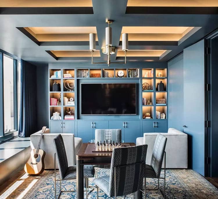
37 – To make your gray accent really stand out, choose a bright, rich shade to serve as the backdrop in your room.
A bold choice with the high-gloss dark blue wall paint in this room, but it paid off in the end: styled with shades of grey in the patterned rug and curtains, the soft colours really pop.
38 – White armchairs in your decor are a great way to contrast a light gray living room.
In this space, a large sofa gray to complement the airy white walls. With the combination of a black striped rug, picture frames and coffee table and end table, the bright decor of the room still looks dynamic.
39 – Light colors can still be predominant, and this living room is proof of that.
This space has been styled with a variety of textures, patterns, and natural materials, but thanks to a neutral palette, they all come together for an intentional design. We love the soft pops of pink and the live plants that bring color to this space.
40 – Gray is an excellent color choice for larger spaces with more traditional decor.
Patterns abound in this living room, but soft gray wall paint and a gray sofa keep the dense prints from overwhelming the simplistic look. Dark wood floors add another element of contrast to ground the room’s lighter pieces.
41 – When creating your little corner with neutral tones, balance is essential.
To achieve a consistent look, it’s a good idea to choose similar fabrics throughout your space. Trying to match a room with only white can be difficult, as different fabrics reflect light differently. Avoid mixing warm and cool by incorporating the same types of fabrics throughout your space.
42 – Gray and white may seem calming, but if you’re not intentional, your room can look tired.
While it's important to choose a consistent color temperature, be sure to vary the shades of gray and white you use to keep things interesting while maintaining balance.
43 – When designing a living room, use neutral tones like gray and white for the larger pieces.
They form the perfect canvas for mixing smaller elements that introduce color. Plus, it’s much easier to swap out smaller pieces than larger ones when making a change to your decor.
44 – It may seem counterintuitive, but adding another neutral color to this composition can make your gray and white shine.
Add very light sand or beige color in a very small dose, with an accent chair, throw or pillow.
45 – A smart way to keep your space balanced is to unbalance it with shades of gray and white.
This will help achieve a crisp, personalized look and keep the space from becoming too monotonous. The accent color will help guide the eye around the space to highlight the art and architecture.
46 – Even warmer shades of gray and white can quickly look washed out.
So it is recommended that you do your best to incorporate more warmth and comfort into your living room, choosing wooden furniture. Whether you choose an oak coffee table or a walnut chair, shades of brown are sure to enhance your gray and white scheme.
47 – In a neutral space, texture is an easy but effective way to add interest without being overwhelming.
You can incorporate wool, leather, wood, and metal wherever possible to elevate the neutral look. Natural woven materials like rattan or wicker are also a great way to add a touch of softness to your gray and white bedroom.
48 – As you probably already know, a gray and white scheme is the perfect backdrop for pops of color.
While you can add just about any color with gray and white, it’s best to keep your pops in pairs. For example, a green throw pillow placed randomly but paired with a green plant or a rug with green accents would tie the space together.
49 – Deeper colors keep gray and white palettes interesting and fresh.
Try working in jewel tones, like dark blues, greens, or Garcia’s favorite, chartreuse. A throw pillow or blanket can be a good place to start, but if you’re feeling bold, try a jewel-toned wall or rug.
50 – Another way to make a neutral space more lively is to incorporate plants.
If you don't have a green thumb, a plant fake or a bouquet of flowers Fresh flowers on the coffee table can have the same uplifting effect in your green and white living room with subtle touches of dark gray.
51 – How to mix textures to add some oomph to a neutral colored room.
You can also mix gray and white patterns that make the perfect backdrop to bring your living room together. Throw pillows in various shapes are a great way to add depth to your space without losing the sense of balance you’re looking for.
52 – Do you have plaster crown molding in your living room? Depending on the look you’re going for, you can integrate it into your gray and white color palette.
If you paint your walls gray, consider leaving the molding of the drywall white to keep things balanced. If you prefer a more contemporary look, paint the molding and walls gray.
53 - Adding Shiplap to Wall Cladding
One color scheme gray and white is the perfect time to consider including bolder furniture throughout your living room, such as a shiplap wall in a neutral or uniform color.
For a modern traditional gray and white scheme, it is recommended to install shiplap vertically on the walls of a room in a soft gray paint color and pair it with white walls.
Conclusion
The gray color palette offers endless possibilities to transform any space. It allows you to play with textures, contrasts and styles, creating unique and charming environments. Don’t be afraid to experiment and remember that decoration is an extension of your personality.
Curiosity: Did you know that gray is one of the favorite colors of interior designers around the world? This is due to its ability to serve as a neutral backdrop, allowing other design elements to shine.
Frequently Asked Questions
What other colors does gray match with?
Gray is extremely versatile. It pairs well with pastel shades for a soft look, vibrant colors for a dynamic contrast, or even with other neutral tones for a more sober style.
How can I use gray in small spaces?
In smaller spaces, opt for lighter shades of gray and use them in combination with plenty of natural light. This helps create a feeling of spaciousness.
Is it possible to use gray in rustic environments?
Yes, absolutely! Gray can be incorporated into rustic environments through elements such as stone, ceramics and natural fabrics.
What is the best way to brighten up a room with gray decor?
Lighting should be warm to create a cozy atmosphere. Lamps with more yellowish tones are ideal for environments with a predominance of gray.
Is gray a good choice for bedrooms?
Definitely! Gray creates a calming ambiance, ideal for bedrooms. Pair it with soft fabrics and soft lighting for a relaxing effect.
Can I use gray outdoors?
Yes, gray is great for outdoor areas, especially for furniture and finishes. It resists weather changes well and blends in with the green of nature.
Ready to transform your space with the elegance of gray? Experiment, be bold and, above all, have fun decorating!
Did you like this amazing tip? If so, share it with your friends and on your social networks. Leave your comment below and your suggestions. Receive it daily here on our website. Blog of ideas and tips free and follow us on Google News too. Thank you!