When it comes to kitchen design, the backsplash Kitchen backsplash isn’t just a passing trend in the world of interior design; it’s the perfect combination of functionality and aesthetics. When we think about renovating or designing a kitchen, we often focus on cabinets, appliances, and countertops. However, the backsplash, that crucial area behind the sink or stove, can be the finishing touch that really makes the difference.
In addition to protecting your walls from unwanted splashes, it offers an opportunity to add a unique and personalized touch to the heart of your home. In this guide, we’ll dive into the world of backsplash, exploring its functionality, benefits, and the hottest trends of the moment.
What is backsplash?
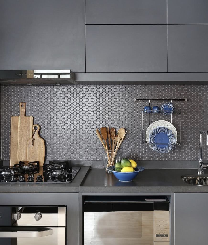
Originating in the US, the term “backsplash” may seem foreign to many. However, it is a simple concept with a significant impact. It refers to the area directly behind the sink and stove, extending from the countertop to the upper cabinets or ceiling.
This area is often subject to splashes of water, oil and other liquids. Therefore, protecting it is essential to keep the kitchen clean and attractive. In Brazil, the trend of covering the kitchen walls from floor to ceiling is common, especially due to the popularity of fried foods.
However, the backsplash offers a stylish alternative, protecting only the most splash-prone area, allowing for greater creative freedom and design options.
Benefits of Backsplash
Economy
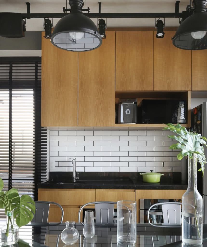
Apply kitchen covering Only in critical areas is a smart decision. It significantly reduces material costs, making the project more economical. Depending on the size of the kitchen, the savings can be substantial. By focusing on the backsplash, you are investing in protection where it is really needed, without compromising the design.
Easy to clean
Ease of maintenance is one of the main advantages of backsplash. Choosing the right materials, such as ceramic, glass or metal, ensures quick and efficient cleaning. These materials are stain-resistant and easy to clean, keeping your kitchen looking fresh and inviting.
Modern Design
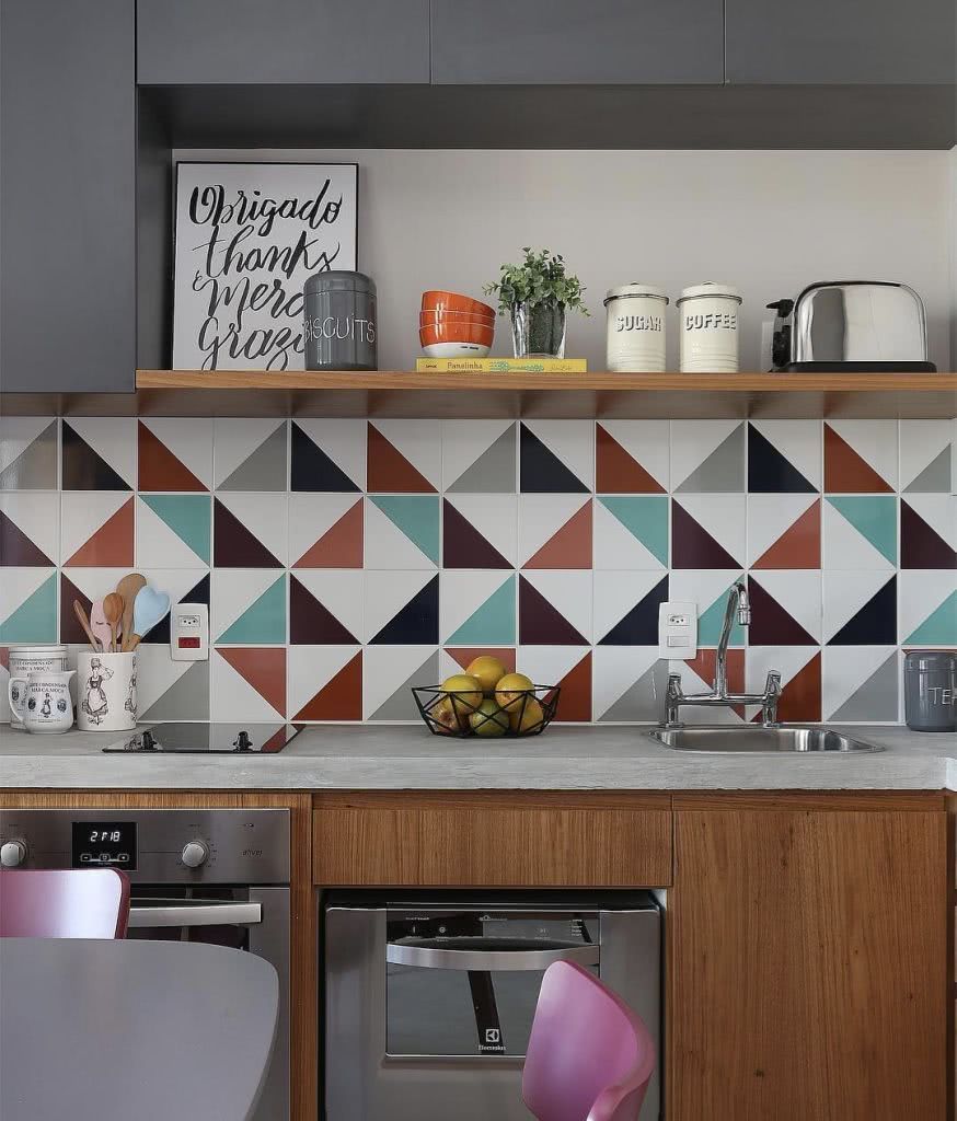
The backsplash is a blank canvas for creativity. From ceramic tiles that mimic natural textures to colorful tiles and mosaics, the options are endless. This area can reflect your personal style, whether it’s classic, modern, rustic or anything in between.
How to choose the perfect backsplash?
Define the Area
Before diving into design and material options, it is crucial to determine the size and extent of the backsplash necessary. Consider the style and frequency of use of the kitchen. For families that cook frequently, especially frying, a larger backsplash may be necessary. Think about functionality first, then style.
Easy to Clean Coating
THE kitchen counter covering It should be easy to maintain. Materials such as ceramic, glass or stainless steel are ideal. They are stain resistant, easy to clean and maintain their appearance for longer. Durability is essential, especially if the kitchen is used frequently.
Low Porosity Materials
The porosity of the material is crucial. Less porous materials, such as glass and glazed ceramics, are less prone to staining and absorbing liquids. This is crucial for areas exposed to pigmented liquids, such as sauces and oils.
Style and Cohesion
Aesthetics are key. Your backsplash should complement the rest of your kitchen. Whether it’s colorful, neutral, textured, or smooth, it should create a cohesive look with your cabinets, countertops, and appliances.
Backsplash Trends
Mirrors
Mirrors aren’t just for bathrooms or dressing rooms. They can visually enlarge a space, making them ideal for smaller kitchens. They also reflect light, making the area feel brighter and airier. However, they do require regular maintenance to keep their appearance looking pristine.
Mosaics and Tiles
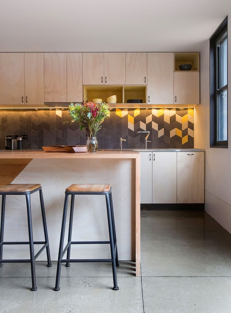
Azulejos são a escolha tradicional, mas isso não significa que sejam básicos ou chatos. Com uma variedade infinita de cores, tamanhos e padrões, os azulejos podem ser organizados de inúmeras maneiras, criando designs únicos e personalizados.
Natural Materials
The trend of bringing the outdoors in is on the rise. Options like stone, marble, and treated wood can create a warm, natural ambiance. They add texture and character to a space, making it feel inviting.
Reflective and Metallic Design
Reflective or metallic materials, such as stainless steel or copper, can add a modern, industrial touch. They’re durable, easy to clean, and bring a sophisticated shine to your kitchen.
Check out these inspiring kitchen backsplash ideas to inspire your own creativity and turn your kitchen into a conversation starter!
59 Ideas Using Backsplash in the Kitchen
01 – Try an opalescent finish
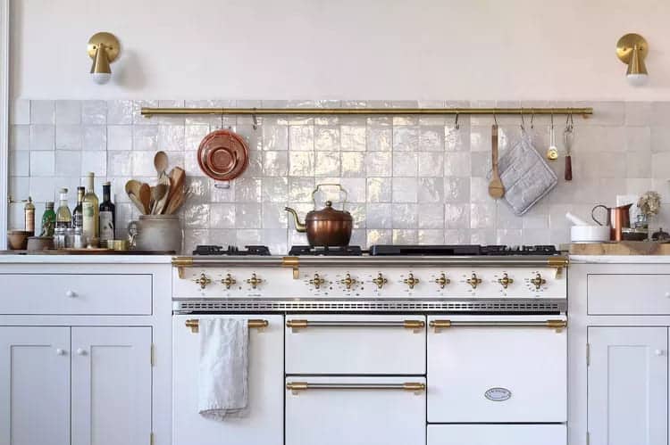
The glossy opalescent tile backsplash in this all-white kitchen by Tara Mangini and Percy Bright, the design duo behind Jersey Ice Cream Co., adds dimension to the neutral color scheme and is the perfect backdrop for a show-stopping gourmet oven. The bronze, stainless steel, and copper tones blend effortlessly to give the kitchen a timeless appeal.
02 – Add modern graphics
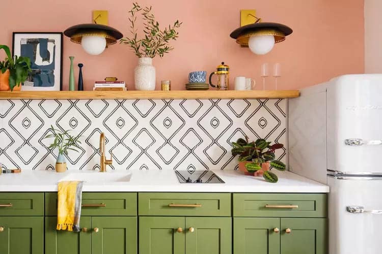
This cheerful pink and green kitchen from Dabito at Old Brand New features a black and white geometric patterned tile backsplash that creates structure among the bright color blocking and helps keep the design feeling airy and modern.
03 – Choose a timeless pattern
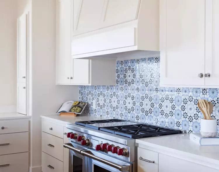
A blue and white patterned backsplash adds a decorative touch to a streamlined white kitchen by Erin Williamson Design. It’s just the right dose of color and pattern to liven up the stark white cabinets and walls, and it never goes out of style.
04 – Use Metal Sheet
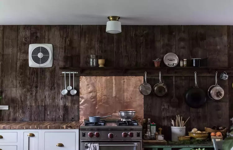
In this rustic-chic kitchen from Jersey Ice Cream Co., a dark distressed wood wall is contrasted with a sheet of bright hammered copper to create contrast and a focal point above the stove. It’s a great lesson in using bold, rich materials in small, thoughtful doses for maximum effect.
05 – Add some accessories
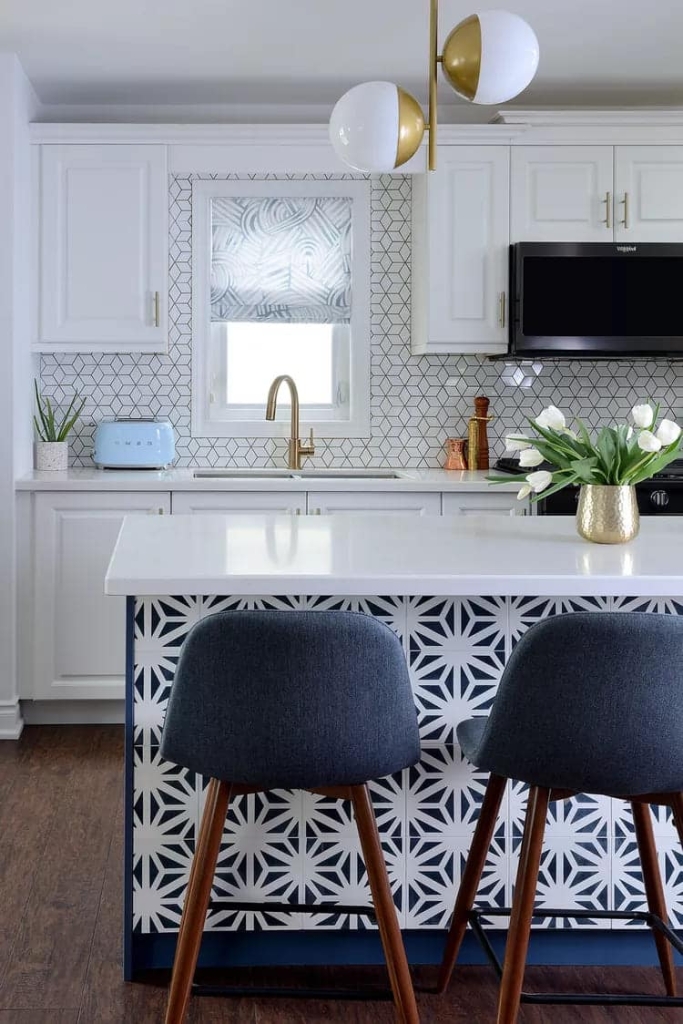
Ontario-based Michelle Berwick Design used a patterned cement tile set on the kitchen island and backsplash of this playful, feminine, mid-century modern-inspired remodel. Look closely and you can see that in addition to incorporating warm metallic accents throughout, the tile is topped with gold grout for an extra dose of backsplash bling.
06 – Personalize your simple kitchen with a modern backsplash
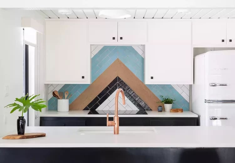
Erin Williamson Design used Fireclay bricks with inlaid wood to create this distinctive custom backsplash that echoes the roofline of the home, a 1950s A-frame cabin. “A minimal stove keeps the focus on the backsplash,” says Williamson, adding that she chose copper plumbing fixtures to complement the wood tones.
07 – Count on Marble
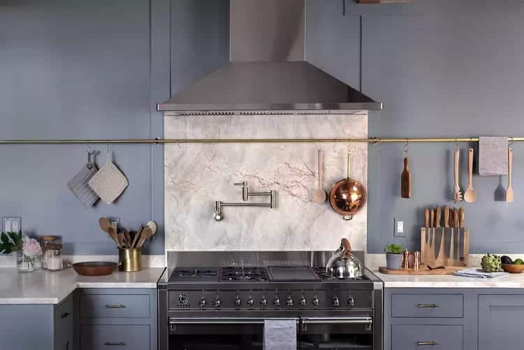
If you love the idea of splashing onto beautiful stone or marble but don’t want to break the bank, focus your efforts on the wall behind your stove, where most of the splashes and splatters will occur. The soft blue-gray paint in this kitchen from Jersey Ice Cream Co. creates a soft backdrop that lets the backsplash shine, creating a stylish and timeless focal point in the kitchen.
08 – Stay Neutral
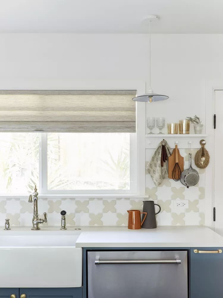
Emily Henderson Design alum Velinda Hellen used eco-friendly artisanal Mini Star and Cross tiles in two complementary neutral hues from Fireclay Tile to create a focal point in this kitchen design.
09 – Beach kitchen with rustic finish
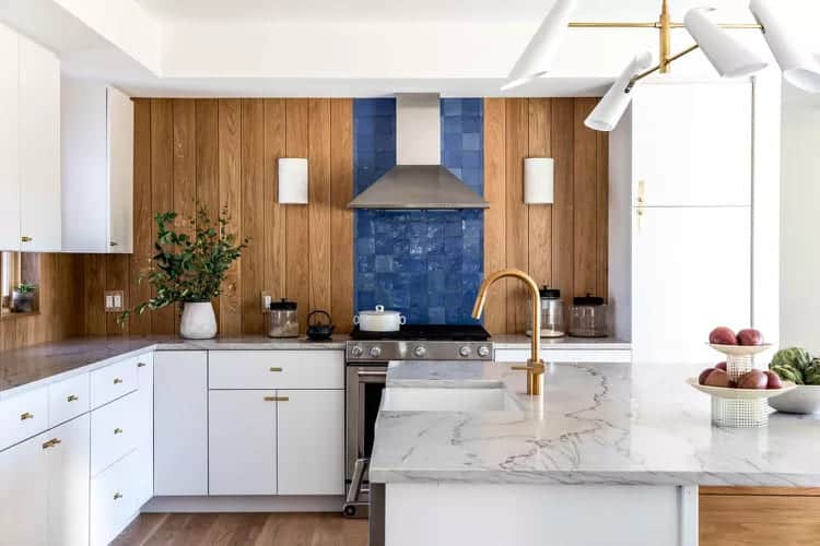
A rich blue tile backsplash from the countertop to the ceiling behind the stove in this casual beach house by Tyler Karu Design + Interiors adds contrast to the rich wood wall paneling throughout. It’s a simple, modern take on coastal design that would work even if you don’t live near the ocean.
10 – Green Tones Layer
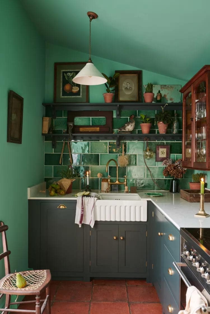
In this timeless English country kitchen designed by deVOL Kitchens, shades of green on the walls, kitchen cabinets and glossy tiles create an earthy, calming atmosphere with terracotta planters, rich wood and brass accents.
11 – Add texture
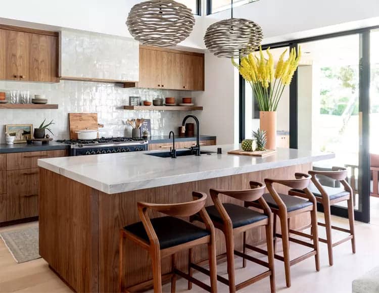
A white backsplash doesn’t have to be utilitarian or boring. In this kitchen design by Laura Brophy Interiors, glossy white Moroccan Zellige tiles add texture and contrast to the warm woods on the floor, island, cabinets, and chairs in this inviting kitchen flooded with natural light.
12 – Add subtle pattern
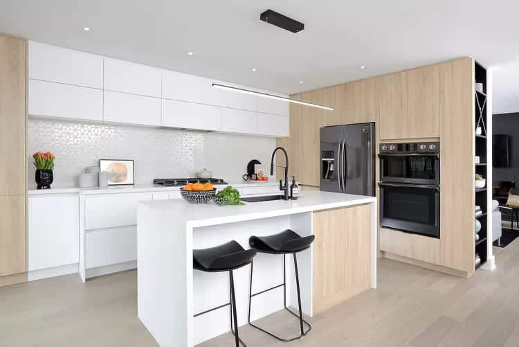
The backsplash in this clean, contemporary kitchen design by Michelle Berwick Design features a geometric pattern that appears nearly invisible thanks to its glossy all-white tile and matching invisible white grout. It’s a subtle approach to using a modern, uncomplicated pattern.
13 – Try peel and stick
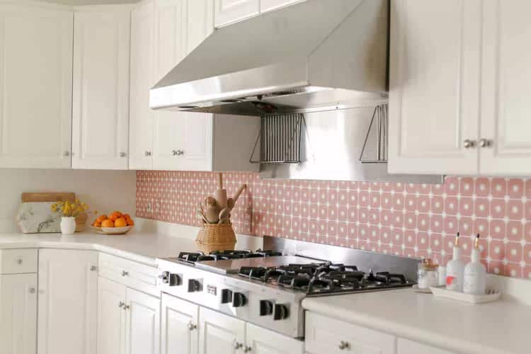
Elsie Larson of A Beautiful Mess makes the case for a removable vinyl trompe l'oeil tile backsplash with this budget-friendly kitchen makeover that looks fresh and is easy to install. It shows that you don't have to spend a lot to transform an ordinary kitchen into something more personal and special, while also demonstrating the power and appeal of using pink in the kitchen.
14 – Reach the ceiling
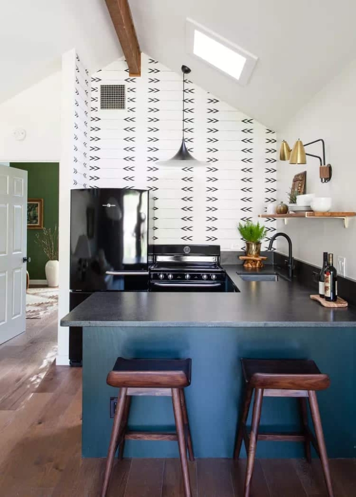
Erin Williamson Design took black-and-white geometric tile to the ceiling of this A-frame Texas lake house to create a combination backsplash and accent wall. Black appliances and countertops tie the neutral scheme together.
15 – Make him moody
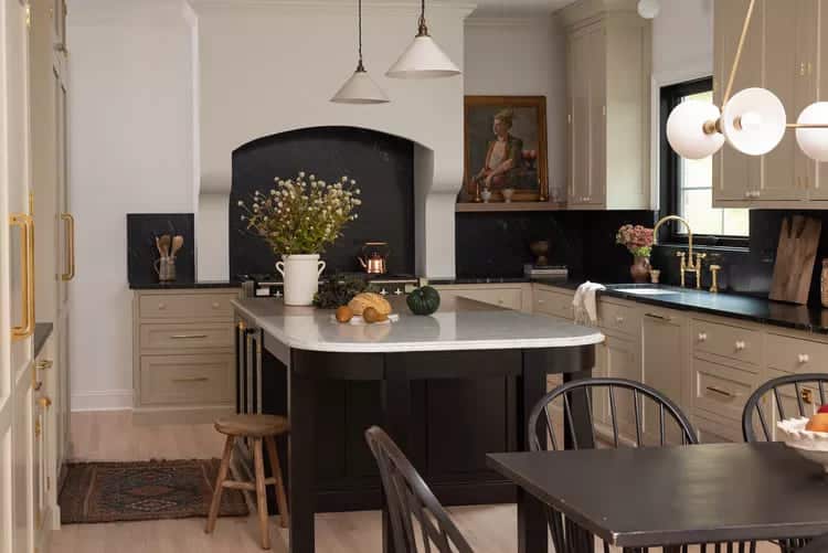
Whittney Parkinson Design used a dramatic black backsplash in this European-inspired kitchen that creates a seamless transition with the countertops and adds high contrast to the creamy white walls and light gray cabinets. The mix of soft neutrals and matte black surfaces gives the open-plan kitchen and dining room a relaxed, grounded, and timeless feel.
16 – Count a finish using textured coating
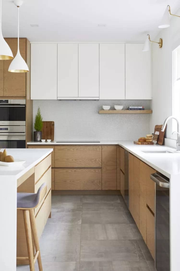
Charlie Coull Design used a one-inch tile in this kitchen that looks like a white wall from a distance but reveals a soft texture with a play of light up close. The simple, timeless tile choice works just as well in a vintage kitchen as it does here, with modern white quartz countertops and light wood cabinets.
17 – Combine light marble with dark walls
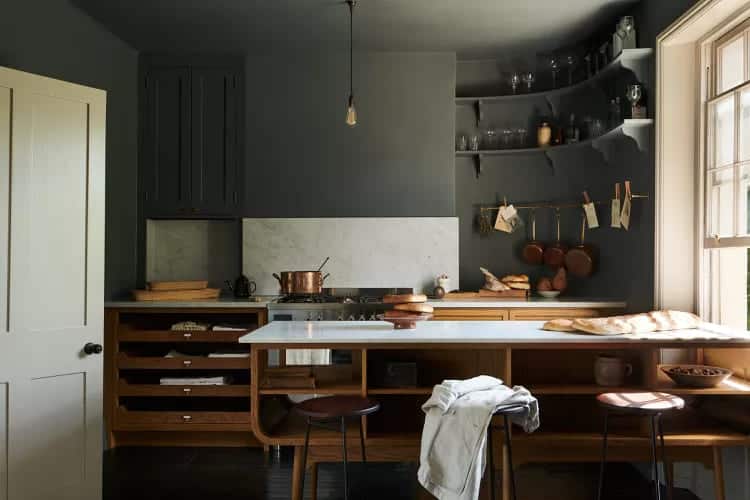
In this Swedish kitchen designed by deVOL Kitchens, dark matte green walls and mid-tone wood create a serene, moody atmosphere that's given some relief by a beige-toned marble slab backsplash.
18 – Play with Geometry
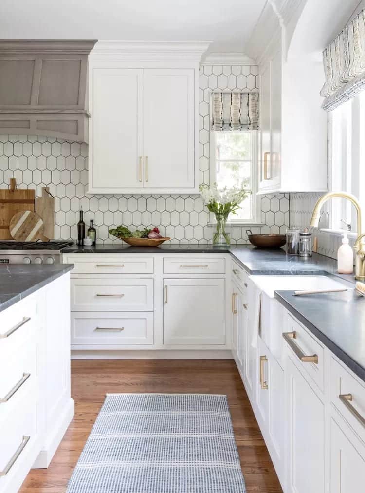
Geometric patterns can add a graphic element to any space. Britt Design Studio chose a backsplash of soft geometric tiles of elongated hexagons arranged in a vertical pattern with dark grout in this neutral kitchen. The tile runs the length of the wall above the oven and stove, giving a subtle sense of rhythm and dynamism that ties the space together while maintaining the airy feel of the room.
19 – Use beige grout
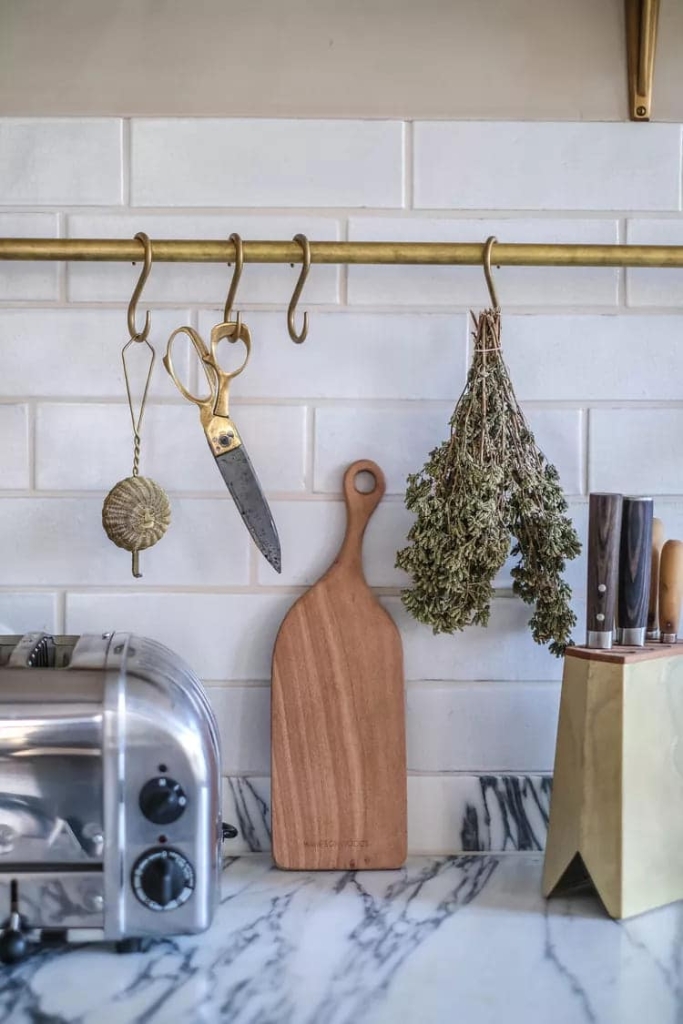
When choosing a white or neutral backsplash, small details matter. In this German schoolhouse kitchen designed by deVOL Kitchens, the simple white tile backsplash is topped with thick lines of beige grout that soften it and give it a rustic, elegant feel that works particularly well in older homes or country-style interiors.
20 – Use a vertical stack
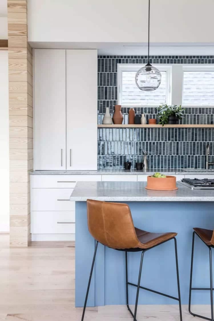
This downtown Portland, ME home by Tyler Karu Design + Interiors, Kevin Browne Architecture, and Benjamin and Company features a deep teal vertical stacked backsplash in an off-kilter layout that creates drama and adds personality to a new build.
21 – Spread the Squares
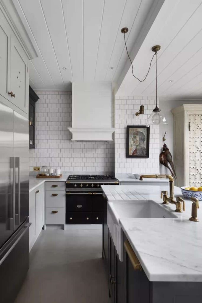
Interior designer Jojo Barr of House Nine chose simple square white tiles with black grout arranged in a staggered pattern to add a modern touch to this traditional family kitchen. The tile looks more like wallpaper than a functional backsplash and helps create the balance between old and new elements that make the kitchen design work, with its modern refrigerator, vintage-style oven, artwork, taxidermy and antiques.
22 – Use shaker style panels
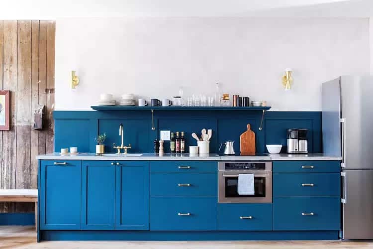
For this blue kitchen at the Lokal Hotel, interior designers Tara Mangini and Percy Bright of Jersey Ice Cream Co. chose a color scheme that works perfectly with the wood in the kitchen. This is a great way to go if you want to create a harmonious look that makes the backsplash a part of the room’s architecture. Use a satin paint for easy cleaning.
23 – Mix cool and warm tones
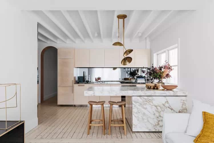
This glamorous beach house kitchen by award-winning Australian firm Decus Interiors features a long mirrored backsplash that reflects natural light and highlights the use of wood, stone and metals in the open-plan space.
24 – Embrace the Green
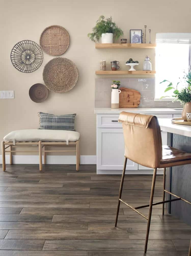
Chelius House of Design chose a large-format subway tile backsplash in a glossy gray color finish for this open-plan kitchen that has an earthy quality that works well with the room's beige and gray palette and complements wood, leather, and fabric accents.
25 – Increase the brightness
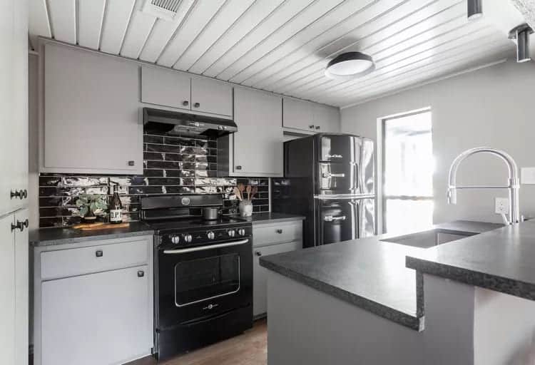
Erin Williamson Design chose glossy black subway tile for the backsplash of this Texas lakefront kitchen. The high-gloss finish reflects light, while black appliances and countertops, stainless steel plumbing fixtures, and light gray paint create a clean, neutral feel.
26 – Cut to fit
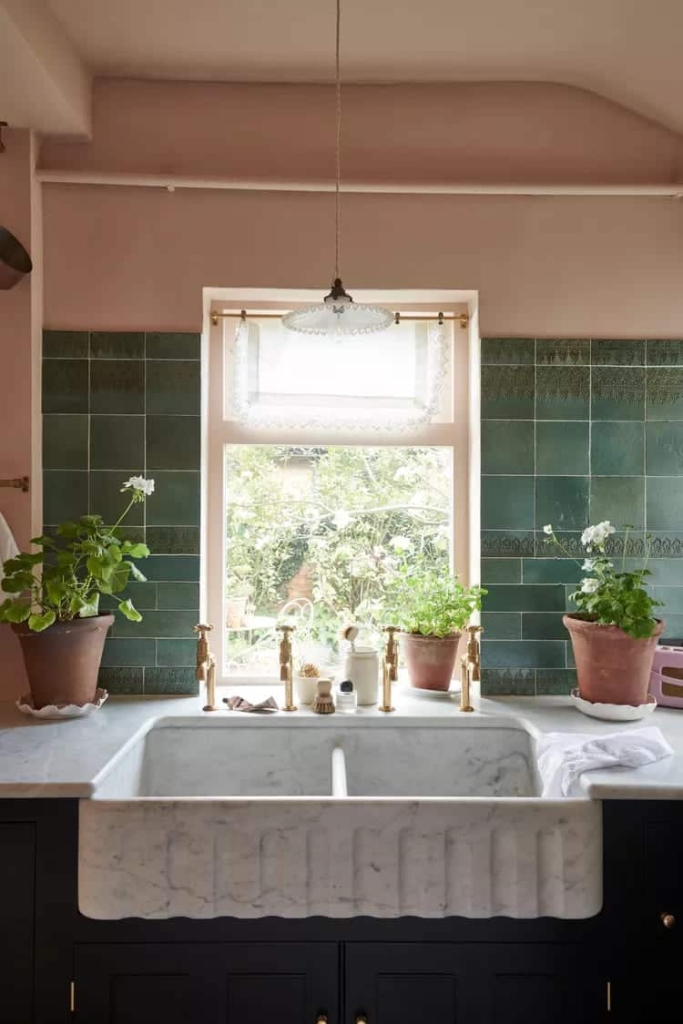
In this Victorian English kitchen designed by deVOL Kitchens, the green tile is cut into different sizes ranging from squares on top to smaller rectangular shapes on the bottom. This variation adds a homey quality and subtle variation in pattern to the simple, timeless hues of the green tile, which works beautifully against the pink walls.
27 – Preserve history
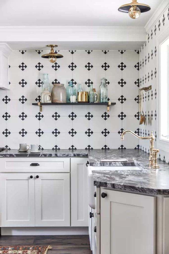
In this historic home renovation in Bath, Maine, Tyler Karu Design + Interiors took the classic black and white backsplash all the way to the ceiling and covered the entire kitchen walls for dramatic effect. The tile pattern alludes to an earlier era while feeling fresh and updated, respecting the home’s historic character while making it comfortable for contemporary living.
28 – Framing
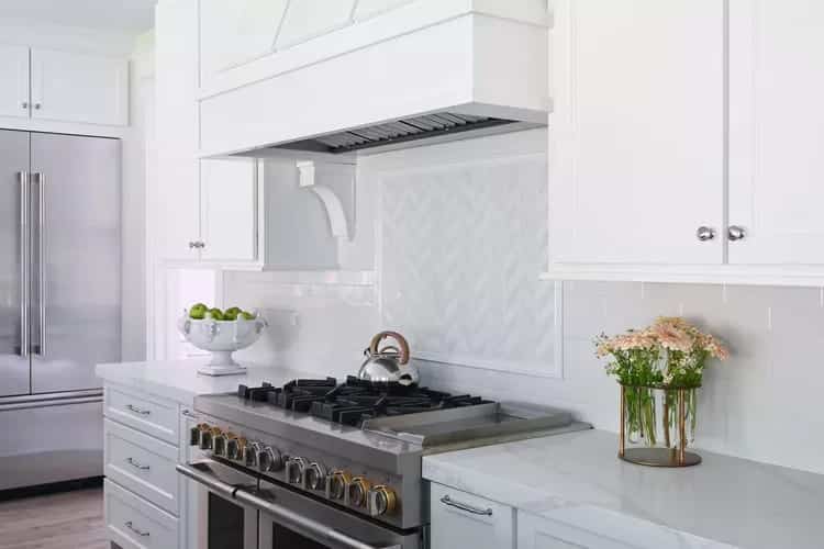
Interior designer Nancy Charbonneau of Charbonneau Interiors and Bill Hughes updated a dark 1980s home by installing a light, glossy subway tile backsplash. A framed herringbone tile above the stove creates subtle variation and a backsplash-within-a-backsplash effect.
29 – Paint the Tile
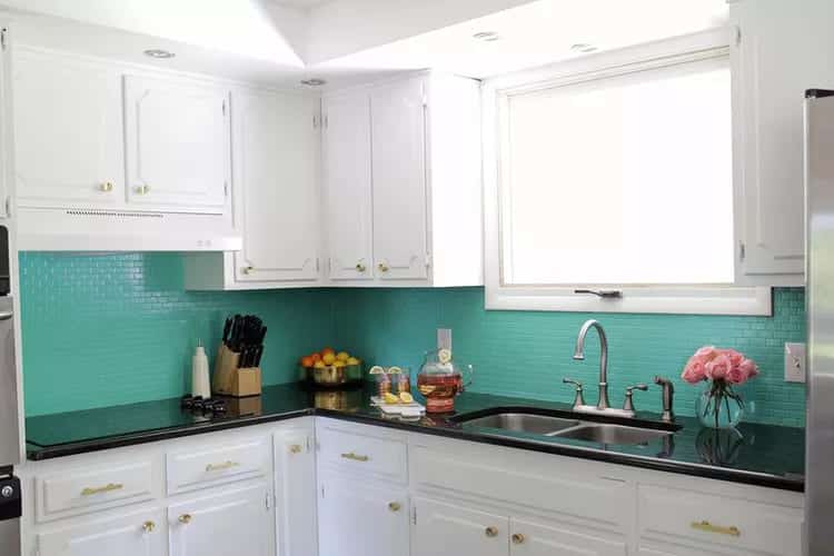
One of the timeless truths of home improvement is that any change, big or small, can have a ripple effect that leads to unexpected consequences. Laura Gummerman of A Beautiful Mess updated her kitchen cabinets, only to find that the new, bright white cabinets made her brown tile backsplash look more tired. She wasn’t ready to replace the backsplash tile, but she had to do something. So she painted the existing backsplash a vivid turquoise hue, an easy and cost-effective DIY intervention that anyone could do.
30 – Use Drama Stone
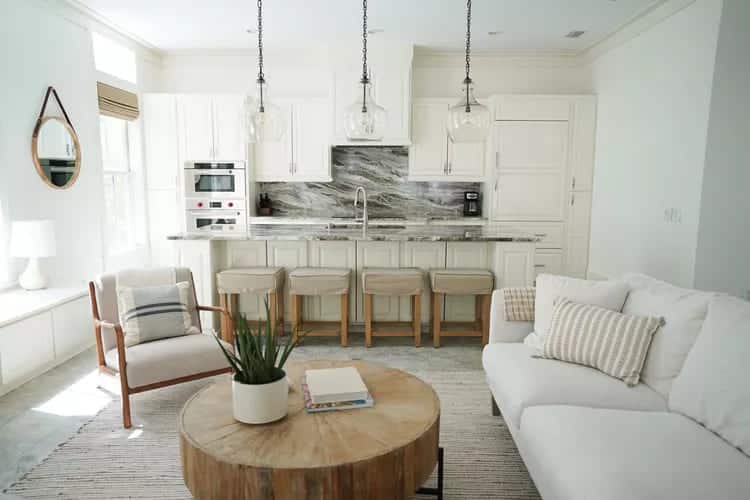
The stormy gray and white backsplash in this beach house kitchen makeover from bloggers and flippers Hannah and Ty of Hannah Tyler Designs creates a dramatic focal point in an open, neutral-toned space that's warmed up with wood accents.
31 – Add Shiplap
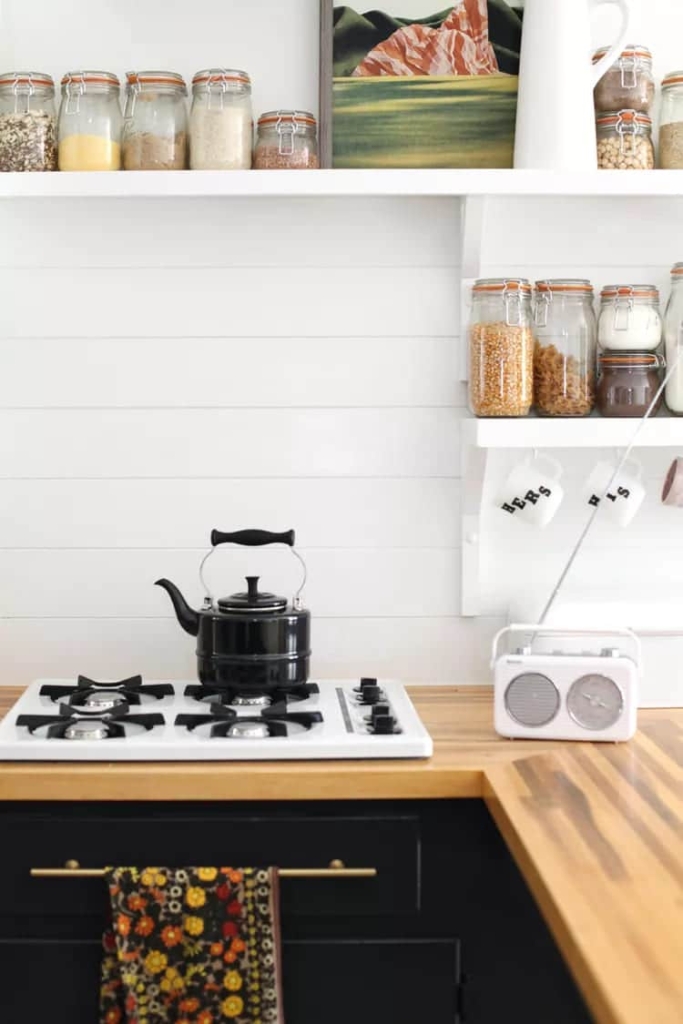
Mandi Johnson of A Beautiful Mess covered a rough-textured kitchen wall with an inexpensive DIY backsplash that gives the kitchen a fresh, homey feel, and was ultimately less of a project than sanding and refinishing the walls.
32 – Choose a dynamic pattern
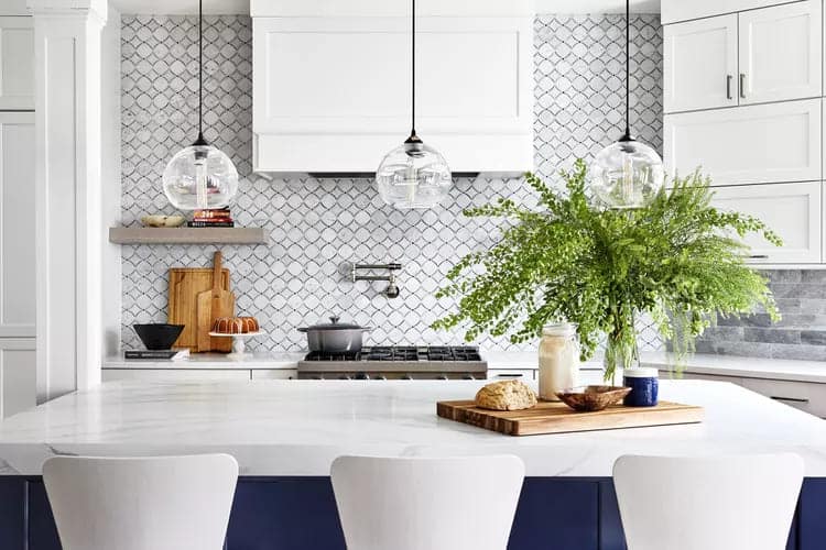
JLA Designs used a dynamic, cool-toned tile pattern for this Bethesda, Maryland, kitchen remodel to create interest and movement. The rounded shapes contrast with the kitchen’s straight lines and the rectangular tile elsewhere in the room.
33 – Stay Square
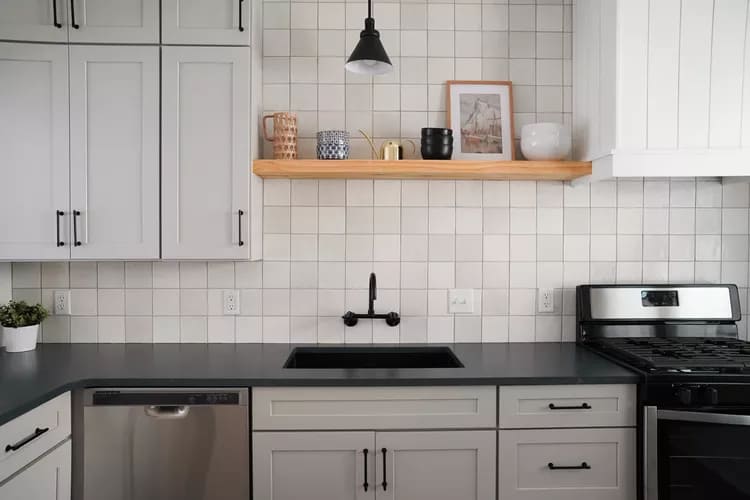
Home renovation bloggers and house flippers Hannah and Ty of Hannah Tyler Designs chose a simple, understated square tile in a grayish-white hue for this kitchen makeover, a budget-friendly alternative to the ubiquitous rectangular subway tile backsplash.
34 – Add touches of luxury
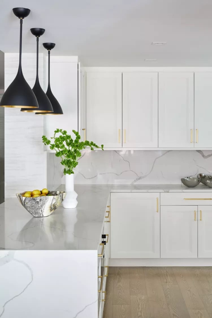
JLA Designs used a timeless marble backsplash that adds subtle pattern while blending with the light cabinetry in this airy, minimalist Manhattan kitchen remodel. The cool stone is warmed up with brass hardware, metallic accents in the pendant lighting, and matte oak wide-plank flooring.
35 – Add a stack of gold bars
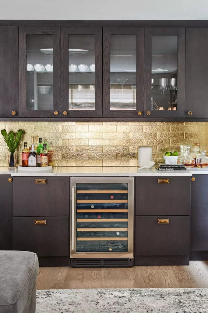
JLA Designs used a dramatic metallic backsplash above the bar area of this open-plan kitchen remodel of a Manhattan apartment that looks like rows of stacked gold bars and adds an unapologetic dose of bling.
36 – Using Simple Hexagons
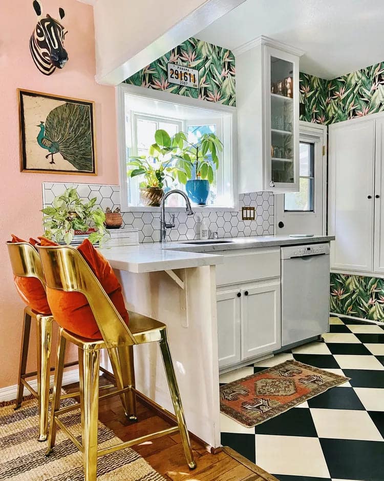
To balance the colorful wallpaper, wall paint, and accessories in this eclectic Costa Mesa, CA. kitchen remodel, K Shan Design installed a clean, modern white hexagonal tile with dark grout.
37 – Embrace the gray
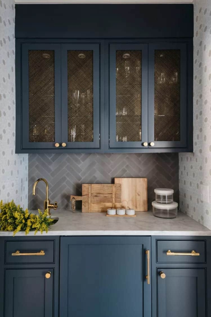
If your kitchen is blessed with a pantry or bar, using varied but complementary backsplashes can highlight individual zones while working together to create an overall design aesthetic. Here, Kate Marker Interiors used a gray subway tile in a herringbone pattern above the pantry sink to distinguish it from the backsplash in the main kitchen.
38 – Add a bronze mirror finish
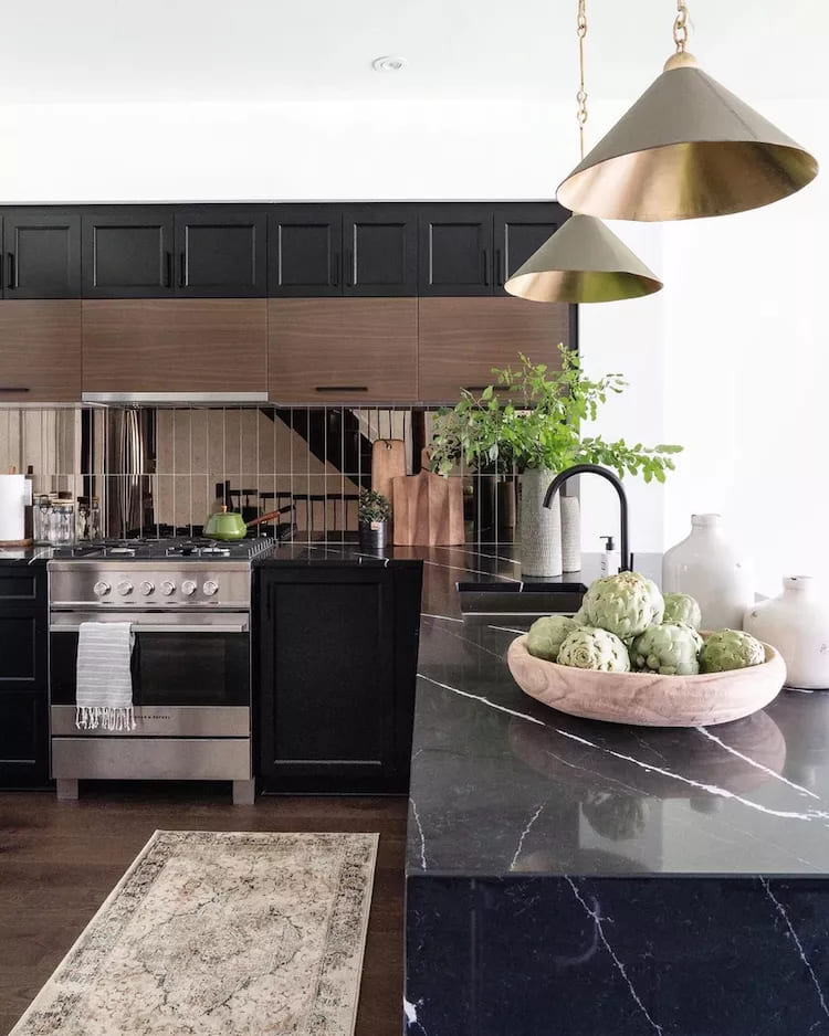
Leclair Decor chose a bronze mirror tile backsplash laid in a vertical pattern to add metallic contrast in this dark-hued kitchen remodel. The warm bronze catches light throughout the day and night, creating a dynamic, ever-changing atmosphere.
39 – Use the Oversized Subway Block
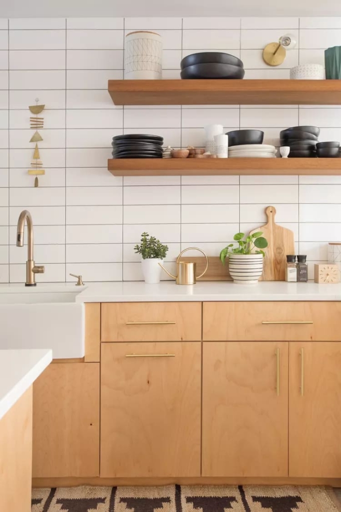
Oversized white tiles stacked rather than staggered with dark grout give this kitchen a clean, contemporary feel. Warm wood and gold-toned metal finishes add warmth. Dark grout looks modern, but it’s also easier to clean than conventional white.
40 – Choose a Classic
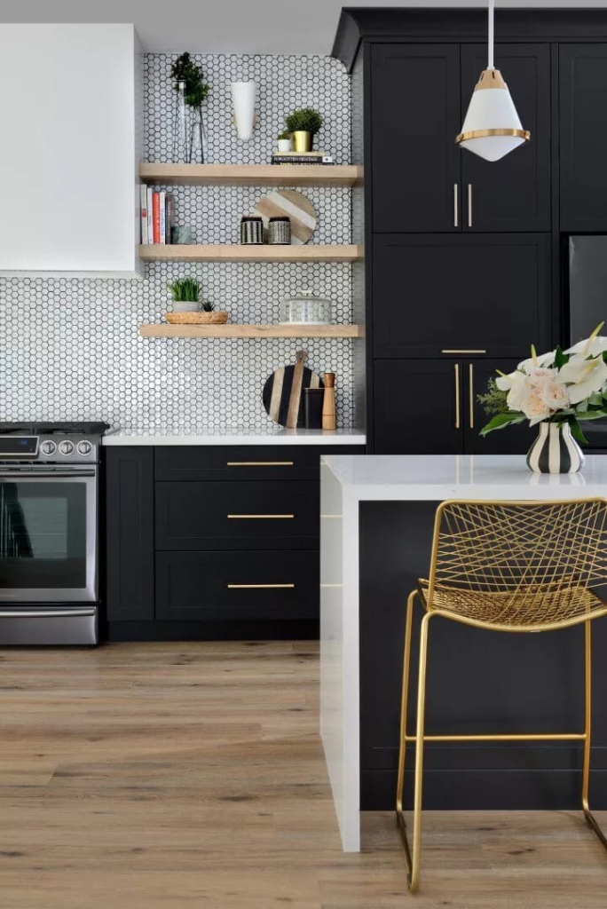
Michelle Berwick Design chose dark grout for this tile backsplash that echoes the black cabinets and complements the kitchen's bold white, black, and bright gold palette.
41 – Whitewashed Brick Backsplash
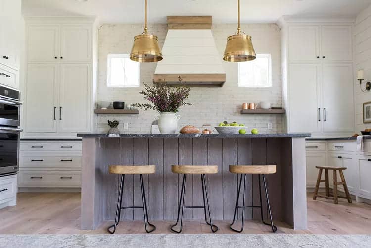
A whitewashed brick backsplash in this kitchen by Whittney Parkinson Design makes the room feel warm and inviting and complements the custom Shaker-style cabinetry, stone countertops, and wood finishes on the island and floor.
42 – Add open shelving
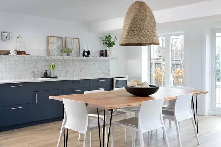
In this basement kitchen renovation, Michelle Berwick Design installed a long stone slab along the wall span that incorporates a sturdy open shelf in the same material. The shelf area adds dimension to the linear design and creates a display area for a dynamic display of plants, art, and accessories.
43 – Change directions
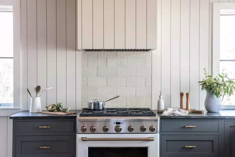
In this streamlined coastal kitchen, Tyler Karu Design + Interiors created a simple but thoughtful play on off-white tones and materials. The horizontal tile backsplash above the stove features a subtle embossed pattern, while the rest of the wall above the countertops is covered in vertical shiplap that extends all the way to the ceiling and covers the oven hood.
44 – Stay clear and soft, seeking tranquility in the environment
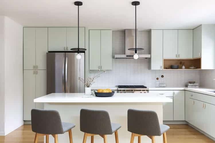
For this minimalist, Japandi-inspired renovation by Cathie Hong Interiors, a backsplash of stacked light gray rectangular tiles creates a whisper of texture and serves as a quiet yet well-considered backdrop for the room's mint green cabinetry and cool-toned silver appliances.
45 – Adicione uma faixa de azul marinho
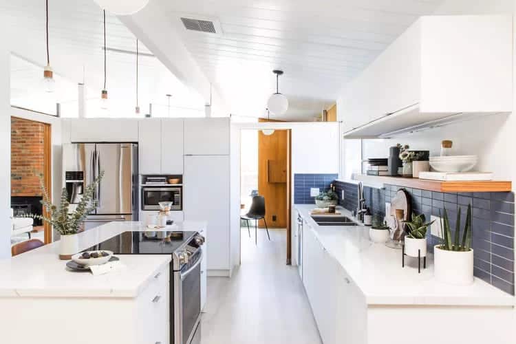
For this Eichler home renovation, Cathie Hong Interiors chose a stacked matte navy blue backsplash from Heath Ceramics that adds depth and contrast in the all-white kitchen.
46 – Bookmark some vintage pieces
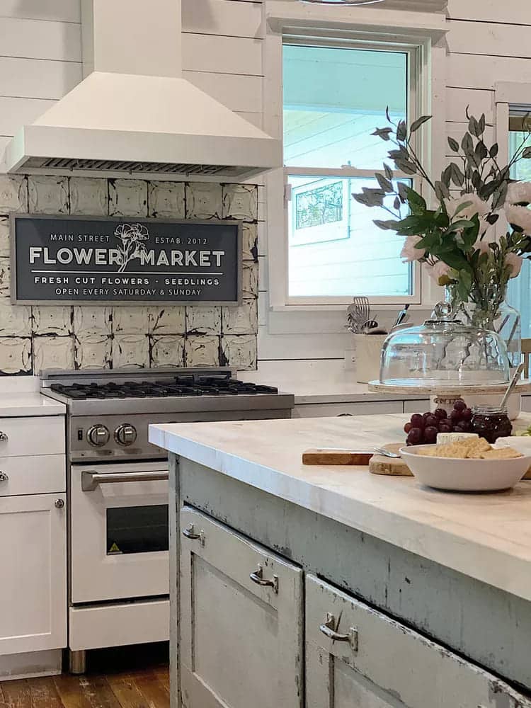
My 100 Year Old Home tiled this Texas kitchen backsplash with vintage tin ceiling tiles that match the rustic, farmhouse chic aesthetic.
47 – Ignore the grout lines
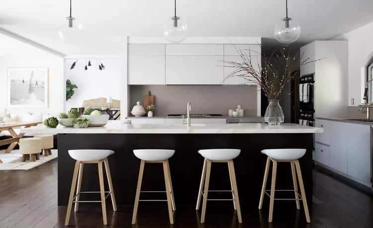
If you prefer a solid backdrop without tiles or grout lines but don't want to go overboard with stone, opt for a monochromatic color-block backsplash in concrete or another matte finish, like this neutral earth-tone backsplash in the Pacific Palisades, CA, home of Jenn Pablo Studio.
48 – Create an Abstraction
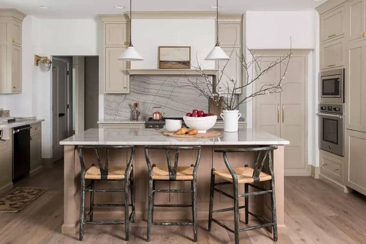
The stone backsplash in this English country-style kitchen by Whittney Parkinson Design looks like a piece of abstract art or a photograph of bare branches. Its graphic black veins add interest and a touch of drama to the room, with its natural palette of soft taupes, grays, browns, and weathered wood tones.
49 – Make it timeless
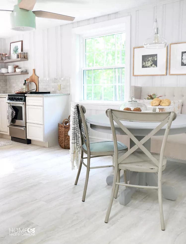
Blogger Ursula Carmona of Homemade by Carmona renovated the kitchen in her contemporary cottage-style guest house with a timeless marble backsplash that matches the rest of the room and complements its soft, neutral tones of gray, beige, and white.
50 – Blacken the pantry
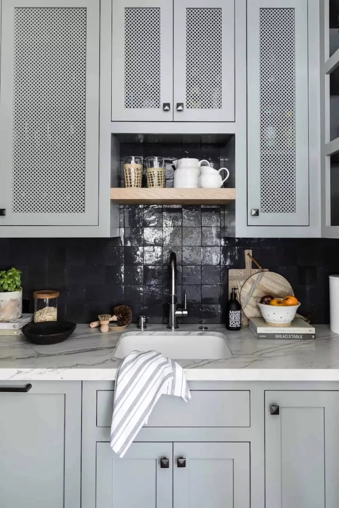
The glossy black square tile backsplash in this kitchen pantry by Mindy Gayer Design Co. stands out from the all-white matte main kitchen backsplash. Visible from both the main kitchen and dining room, the pantry’s dark tile creates contrast and a sense of depth to the smaller space.
51 – Keep the light
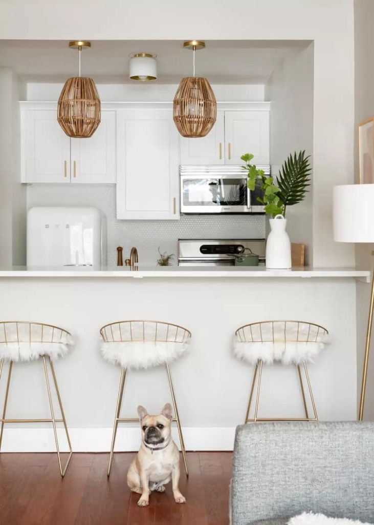
esiree Burns Interiors chose white tiles for the backsplash of this glamorous bachelorette pad. The timeless tiles add subtle texture and pair perfectly with marble countertops, white cabinets, and a Smeg refrigerator. Pops of metallic gold bring the shine, and natural materials like wood and rattan warm it up.
52 – Stay Clean as a Bone
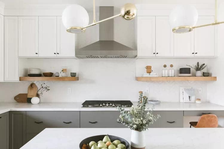
Cathie Hong Interiors chose matte white subway tile for this clean, contemporary family kitchen. Laid in a herringbone pattern, it helps break up the linear lines of the cabinets, countertops, and floating shelves.
53 – Framing
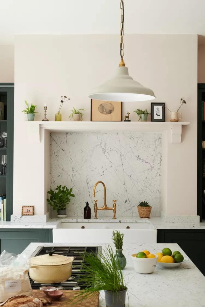
In this spacious kitchen designed by deVOL Kitchens, the stove is located in the kitchen island, while the sink is recessed into a side wall, its stone backsplash recessed and framed like a work of art.
54 – Add a window
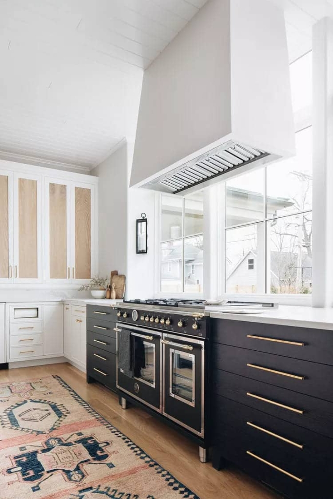
In this spacious kitchen by Kate Marker Interiors, a large picture window acts as a backsplash above the professional-grade oven and stovetop, flooding the modern farmhouse-style space with light.
55 – Inject some bright color
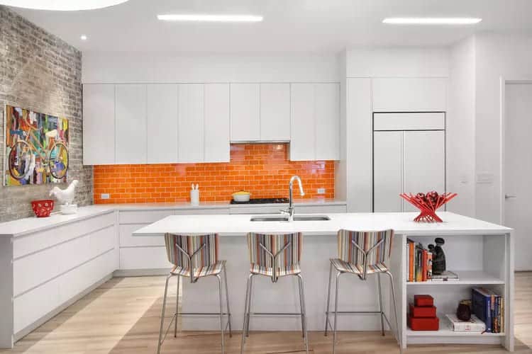
Interior designer Ghislaine Viñas gave an all-white kitchen a makeover with a bright orange subway tile backsplash. The backsplash tile’s limited footprint means it can be swapped out in the coming years without renovating the entire kitchen.
56 – See your reflection
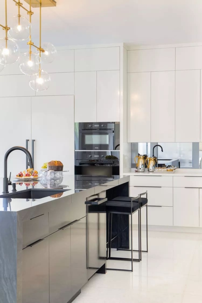
Interior designer Maite Granda used a simple mirrored backsplash to complement the glossy white cabinets and black and silver fixtures in this sophisticated Florida kitchen.
57 – Try Terrazzo
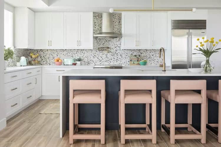
In this kitchen by Lisa Gilmore Design, a terrazzo tile backsplash introduces subtle pops of color and personality to the wall hung with all-white cabinetry.
58 – Let the Sunshine In
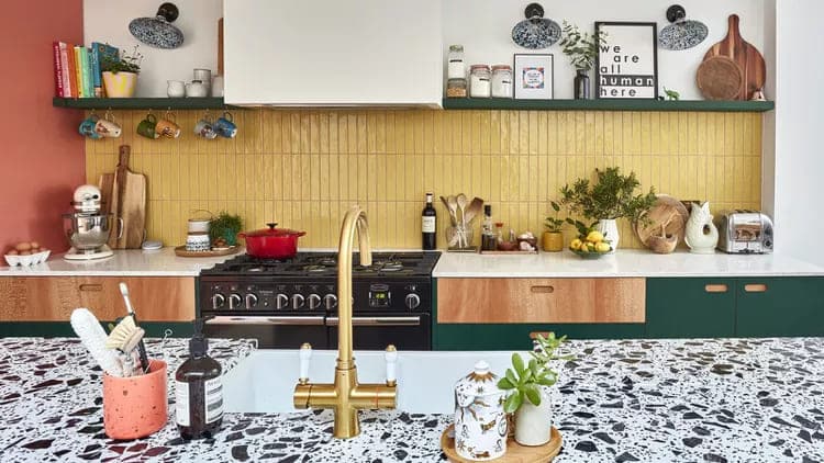
This kitchen from Pluck features wall-to-wall stacked vertical tiles in a sunny shade of yellow that anchors the space and holds its own alongside matte forest green cabinets and shelving, white and coral walls, and a graphic white and black island countertop.
59 – Make it monochromatic
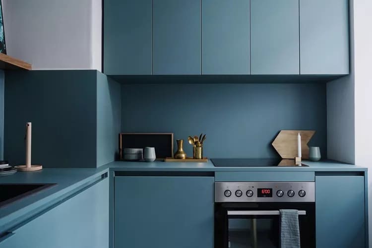
This Scandinavian kitchen from Fantastic Frank has a calming contemporary feel with its integrated backsplash drenched in a cool shade of blue that matches the flat front cabinets to create a seamless look. When considering a backsplash, the perfect combination of functionality and design is key.
It should meet the practical needs of your kitchen while reflecting your aesthetic and style. With the options available today, finding the perfect fit is easier than ever. And with the right information and a little inspiration, your kitchen can transform into a space that’s both functional and stylish.
Did you like this amazing tip? If so, share it with your friends and on your social networks. Leave your comment below and your suggestions. Receive it daily here on our website. Blog of ideas and tips free and follow us on Google News too. Thank you!